
A Horrendous Job Report Looks Even Worse Under the Surface
The analysis below covers the Employment picture released on the first Friday of every month. While most of the attention goes to the Headline Report, it can be helpful to look at the details, revisions, and other reports to get a better gauge of what is really going on.
Current Trends
The jobs report showed an unexpected loss in jobs of -92k. The Household report was even worse with a loss of 185k jobs, which follows the loss in January of 895k jobs. This paints a very negative picture of the job market.
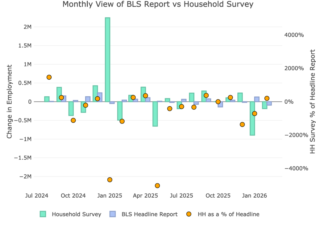
Figure: 1 Primary Report vs Household Survey – Monthly
The Household Report has been underperforming the Headline report for years. While that changed in 2025, it was primarily due to a one-off data adjustment in January of last year. For the year, the Household Report now shows a loss of over 1M jobs for the year. That is through two months!
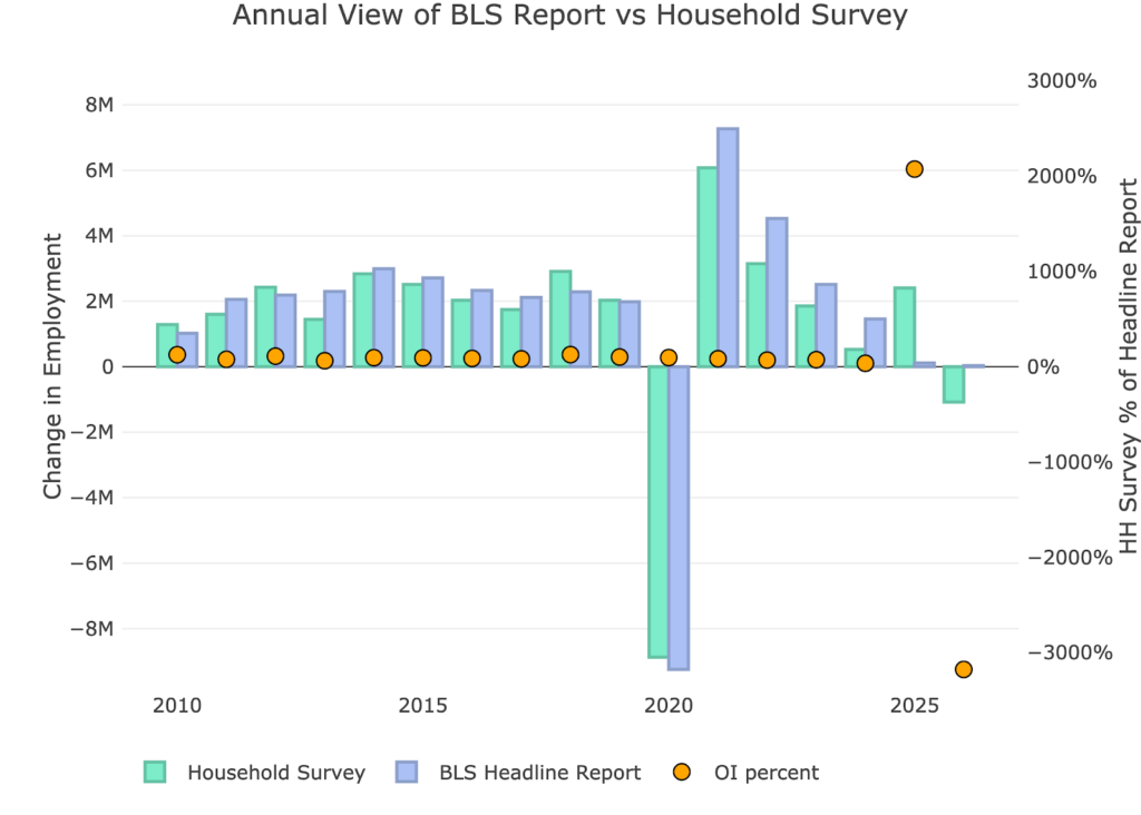
Figure: 2 Primary Report vs Household Survey – Annual
The BLS publishes the data behind their Birth/Death assumptions (formation of new business). The data showed that the BLS actually assumed job creation of 90k jobs in February. This makes the headline number even more concerning considering it feels hard to believe enough new businesses formed in Feb to justify 90k jobs. To be fair, this followed January which assumed a job loss of 61k due to birth/death.
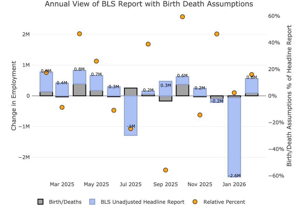
Figure: 3 Primary Unadjusted Report With Birth Death Assumptions – Monthly
For the year, the birth death assumption is barely positive of 29k jobs.
Figure: 4 Primary Unadjusted Report With Birth Death Assumptions – Monthly
Digging Into the Headline Report
Unfortunately, despite being highly unreliable, the Headline report is the best data we have for the more recent periods. Furthermore, this is the data the Fed uses to shape its policy. The 92k jobs lost hit every category except “Other”. It was also accompanied by a jump in the unemployment rate to 4.4%.
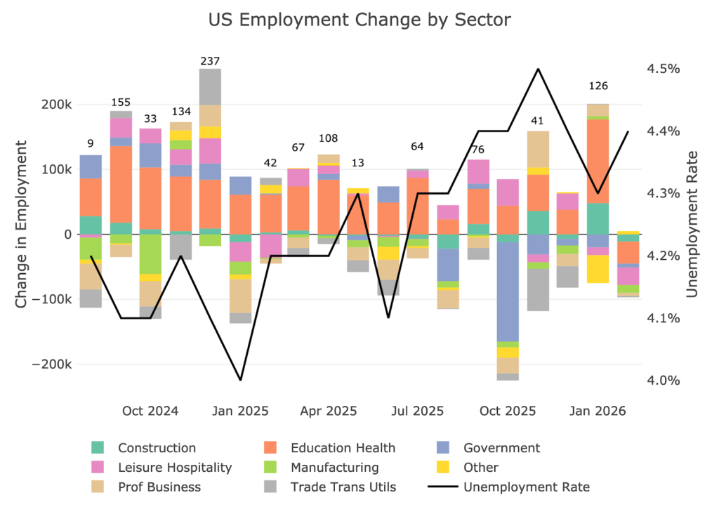
Figure: 5 Change by sector
Jobs by Category
When looking at the last 12-month trend, you can see that every job category was negative except for Other. Ironically, that category is actually positive over the last twelve months. It is one of only three categories that is positive for the last 12 months. This shows a very weak labor market.
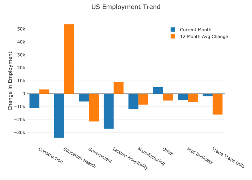
Figure: 6 Current vs TTM
The table below shows a detailed breakdown of the numbers.
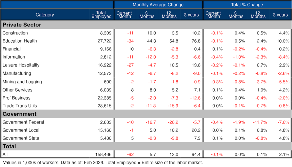
Figure: 7 Labor Market Detail
Revisions
This is the biggest story of the jobs report. After all the revisions, the job picture is significantly bleaker than the data originally showed. Not only was every month in 2025 revised down, but 4 of the months had negative growth. January continued the trend, albeit only a modest revision down (so far).
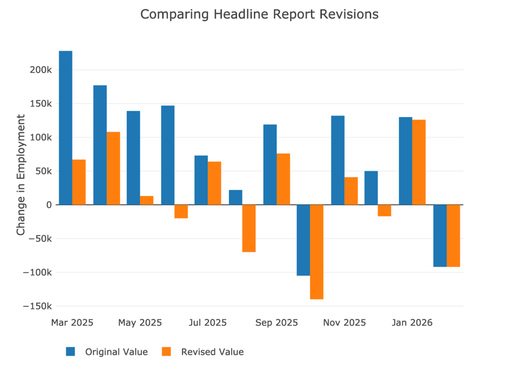
Figure: 8 Revisions
Over the last twelve months, jobs have been revised down by about 76.5k per month!
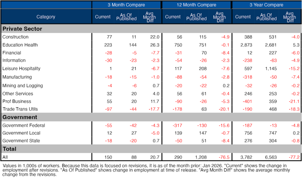
Figure: 9 Revisions
More Detail in the Household Survey
Another level of detail in the Household report shows full-time vs part-time job holders. The data shows full time jobs being lost over the last two months which is another negative sign.
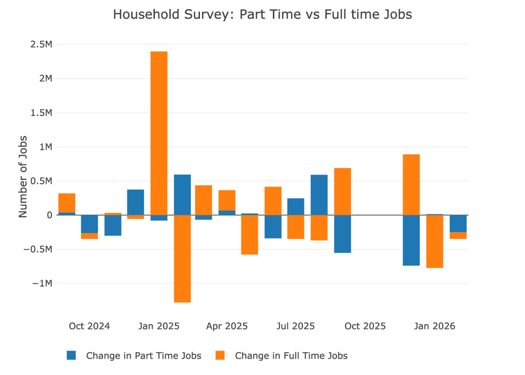
Figure: 10 Full Time vs Part Time
Historical Perspective
The chart below shows data going back to 1955.
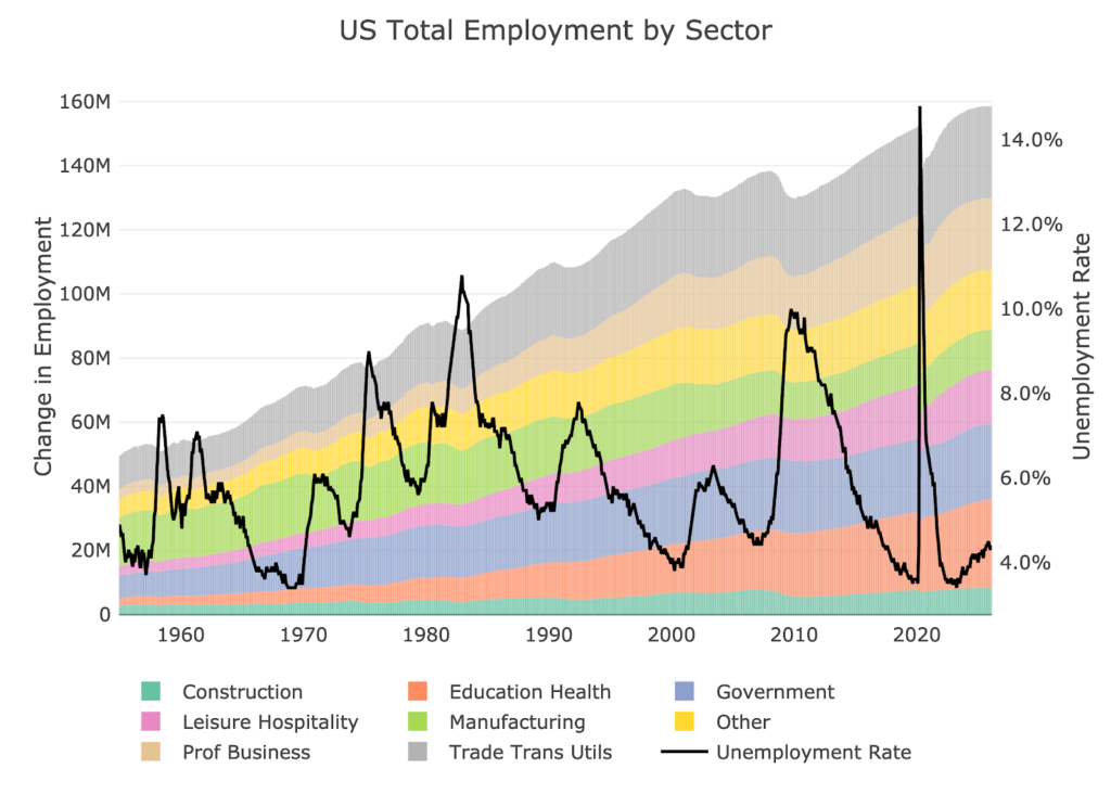
Figure: 11 Historical Labor Market
The labor force participation rate is still well below the highs before the Global Financial Crisis. This month showed it falling to 62%.
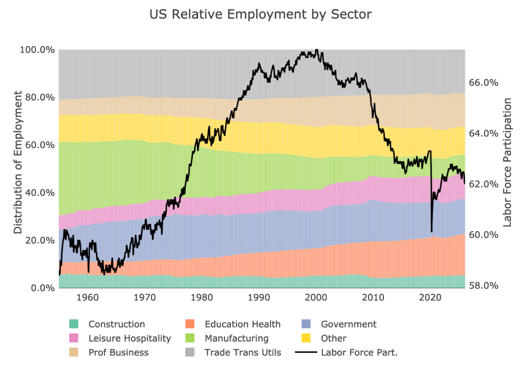
Figure: 12 Labor Market Distribution
Conclusion
By every measure, this is a horrendous job report. Job losses are happening across the board. The more troubling story is that the Headline Report is usually much rosier than the truth. As job revisions continue to pull the numbers down, it is likely this 92k gets even worse as more data comes in. We are now in a global conflict with a flailing job market. Buckle up!

Receive SchiffGold’s key news stories in your inbox every week – click here – for a free subscription to his exclusive weekly email updates. Interested in learning how to buy gold and buy silver? Call 1-888-GOLD-160 and speak with a Precious Metals Specialist today!