
Only 181k Total Jobs Gained for all of 2025 after Massive Revisions Lower
The analysis below covers the Employment picture released on the first Friday of every month. While most of the attention goes to the Headline Report, it can be helpful to look at the details, revisions, and other reports to get a better gauge of what is really going on.
Current Trends
The jobs report showed an increase of 130k jobs in January. This was a beat over expectations but would objectively be considered a weak report. More surprising is the Household Report which showed a gain of 528k jobs. This is very strong, but it should be taken in context. Last January a similar event happened but to a greater extreme – the Household report showed 2.24M gained vs a 50k loss.
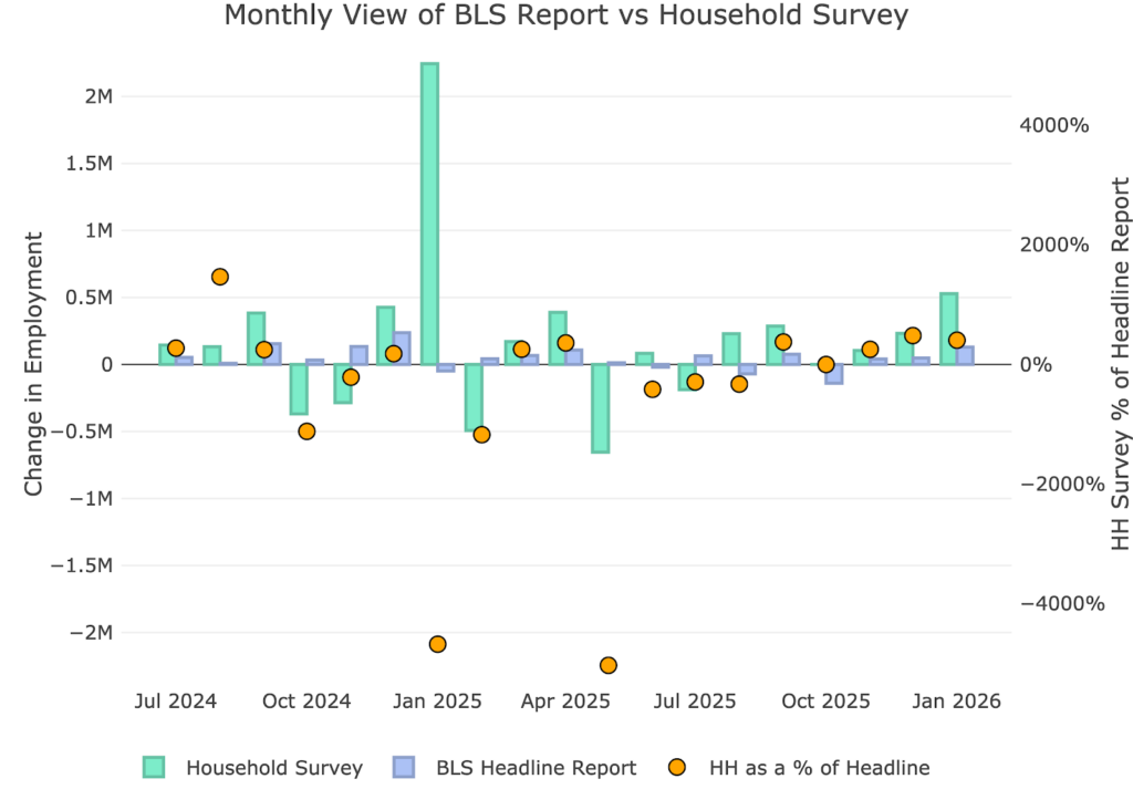
Figure: 1 Primary Report vs Household Survey – Monthly
The Household Report has been underperforming the Headline report for years. That changed in 2025. For the year, the Headline report showed a gain of 181k jobs. To repeat, that is total jobs gained for the year! The Household report showed 2.4M, but excluding the massive gains in January, the reports actually get quite close.
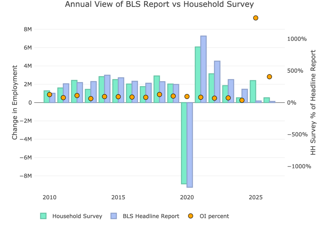
Figure: 2 Primary Report vs Household Survey – Annual
The BLS publishes the data behind their Birth/Death assumptions (formation of new business). The data is through December of 2025 and December showed an assumed loss of 67k jobs.
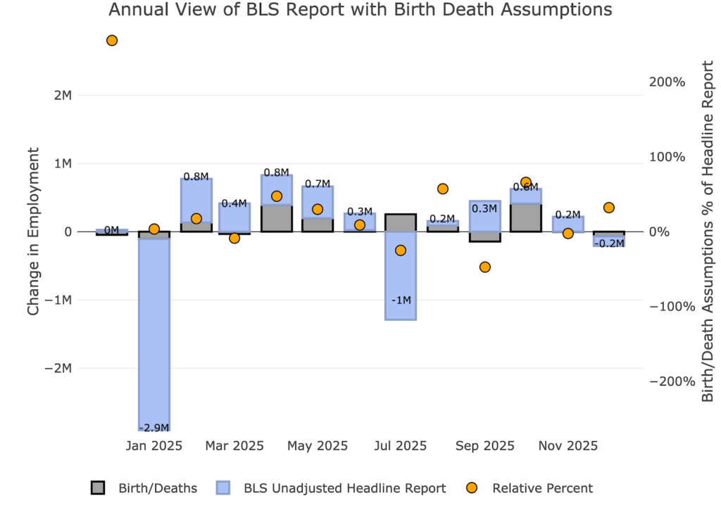
Figure: 3 Primary Unadjusted Report With Birth Death Assumptions – Monthly
For the year, the birth death assumption is a positive 1.15M against negative actuals of -1.08M. This means all positive growth YTD is directly tied to the birth/death assumptions.
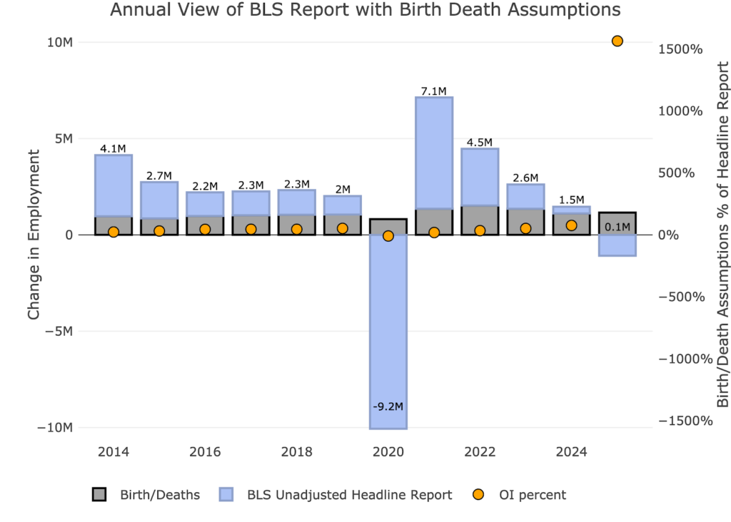
Figure: 4 Primary Unadjusted Report With Birth Death Assumptions – Monthly
Digging Into the Headline Report
Unfortunately, despite being highly unreliable, the Headline report is the best data we have for the more recent periods. Furthermore, this is the data the Fed uses to shape its policy. The 130k jobs number was accompanied by a fall in the unemployment rate to 4.3%.
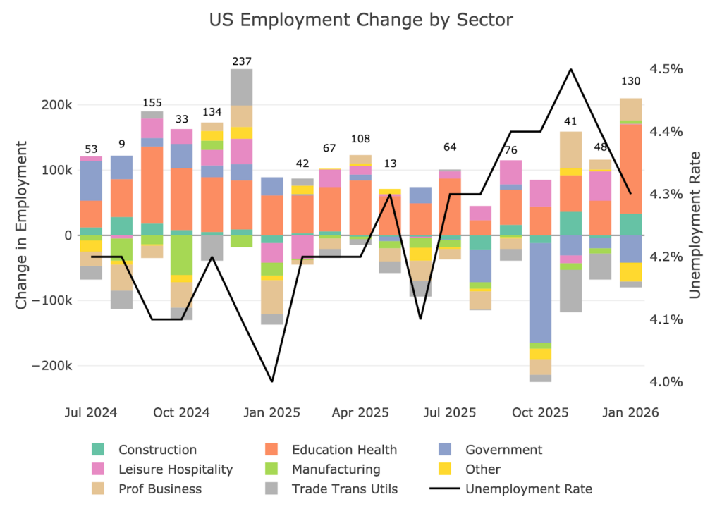
Figure: 5 Change by sector
Jobs by Category
When looking at the last 12-month trend, only half of the categories were actually above trend. The big drivers of the gains came from Education and Health which added 137k total jobs.
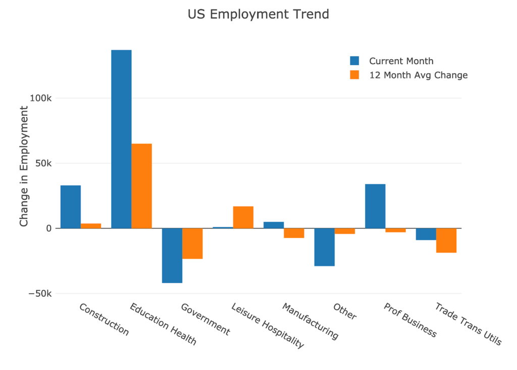
Figure: 6 Current vs TTM
The table below shows a detailed breakdown of the numbers.
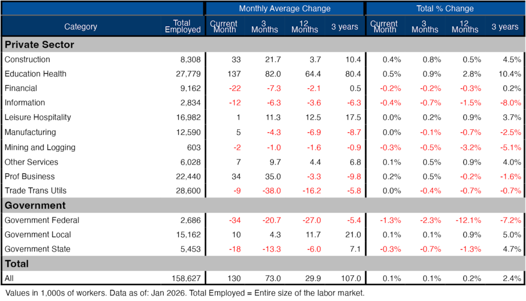
Figure: 7 Labor Market Detail
Revisions
This is the biggest story of the jobs report. After all the revisions, the job picture is significantly bleaker than the data originally showed. Not only was every month in 2025 revised down, but 3 of the months had negative growth. Can you imagine how the market would have responded in October to a net job loss of 140k jobs?
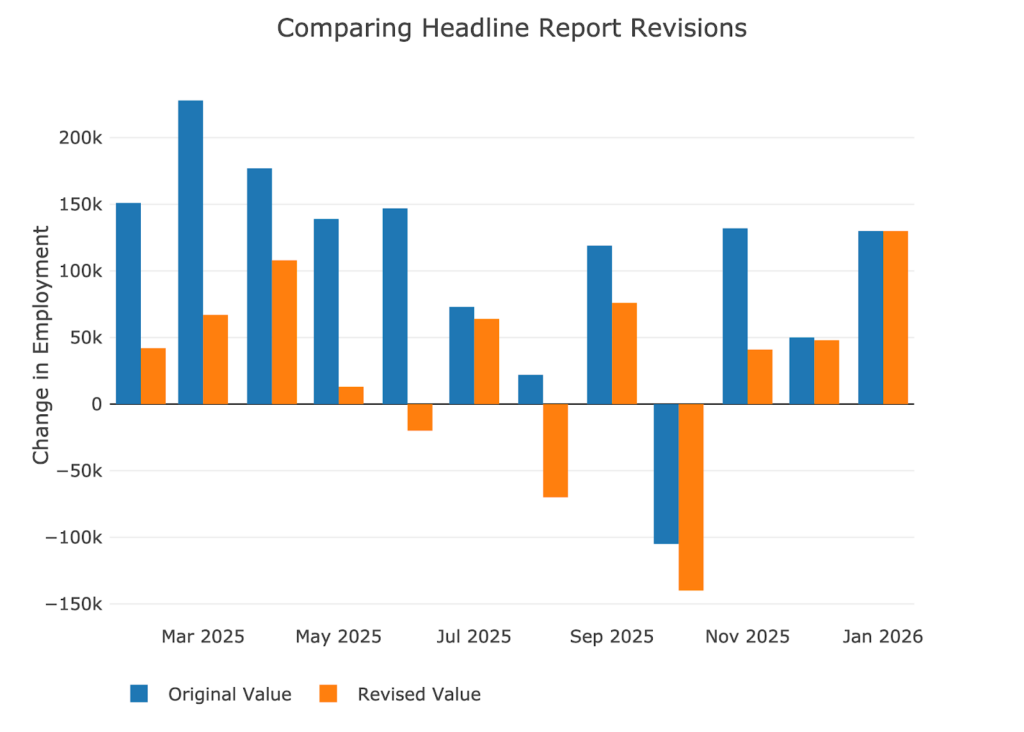
Figure: 8 Revisions
Over the last twelve months, jobs have been revised down by about 105k per month and revised lower by 98.3k over the last three months! This means that over 1.2M jobs have vanished due to revisions.
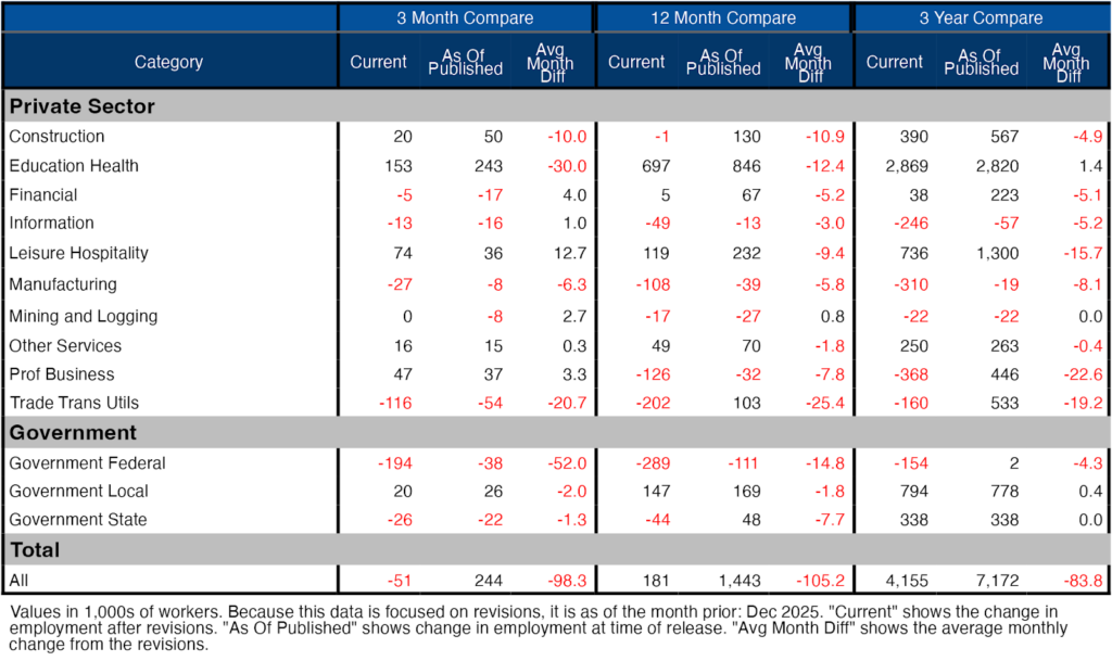
Figure: 9 Revisions
More Detail in the Household Survey
Another level of detail in the Household report shows full-time vs part-time job holders. The data in the Household report does show that full-time jobs are being added which is good.
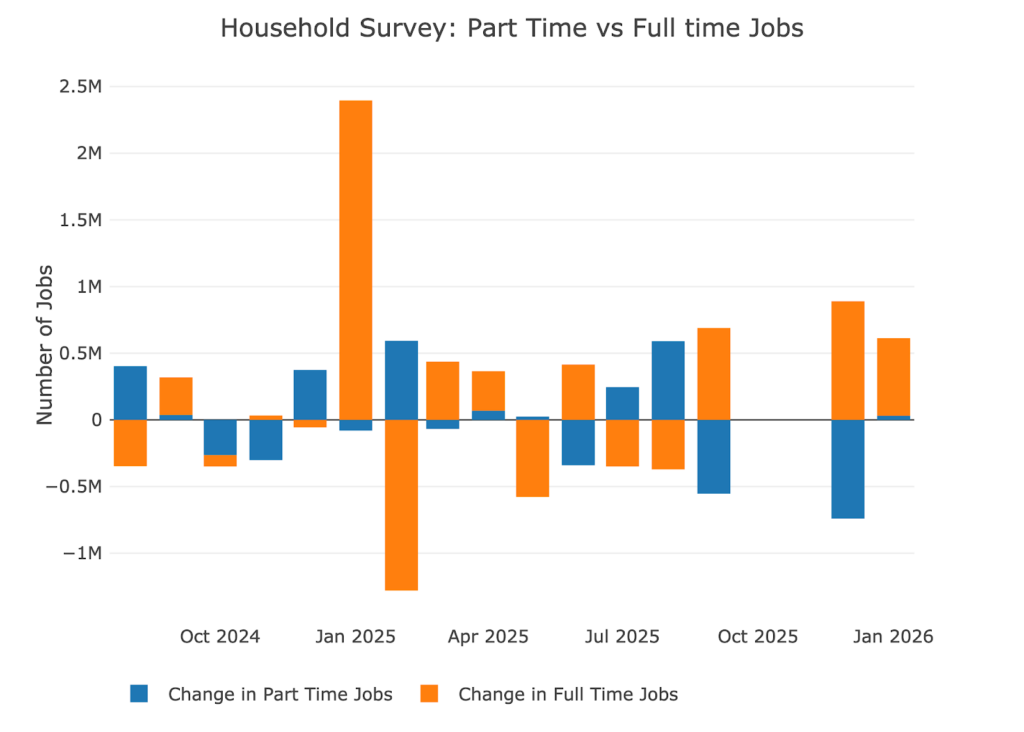
Figure: 10 Full Time vs Part Time
Historical Perspective
The chart below shows data going back to 1955.
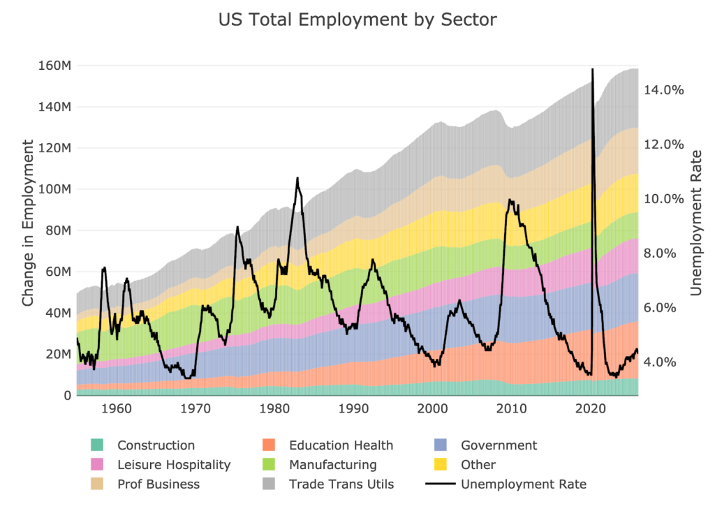
Figure: 11 Historical Labor Market
The labor force participation rate is still well below the highs before the Global Financial Crisis. This month it increased slightly to 62.5%.
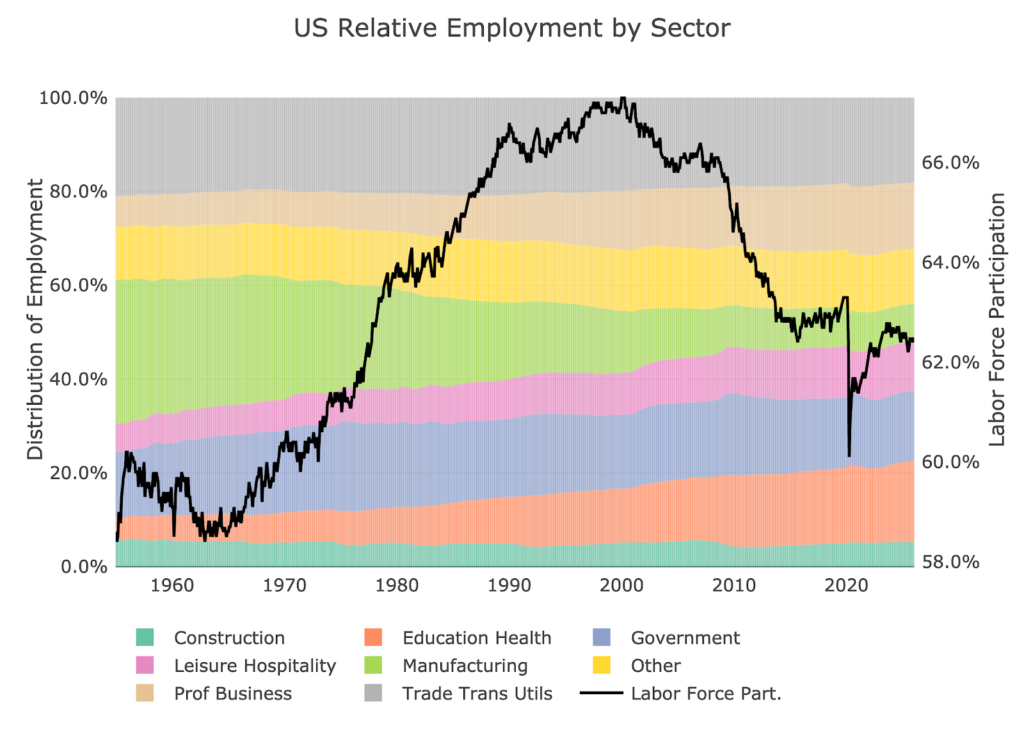
Figure: 12 Labor Market Distribution
Conclusion
The US economy averaged job gains in 2025 of 15k a month. That is abysmal and pretty much tells you that the economy is in recession. Furthermore, remember the data point above that the gains have come entirely from the formation of new businesses. This means that even the very meager job gains in 2025 exist due to basic BLS assumptions of new jobs based on the formation of new businesses. The US economy is very weak and the Fed is going to have to step in. This is why gold and silver continue to show strength despite the recent volatility.

 Live Chat
 Email:
  Phone: 1-888-465-3160