
Jobs: QCEW shows over 2M jobs lost in Q1
The analysis below covers the Employment picture released on the first Friday of every month. While most of the attention goes to the Headline Report, it can be helpful to look at the details, revisions, and other reports to get a better gauge of what is really going on.
Current Trends
The jobs report showed a surprise gain of 162k jobs in August. Furthermore, the Household Survey, which has generally been underperforming the Headline Report, showed a massive gain of 569k.
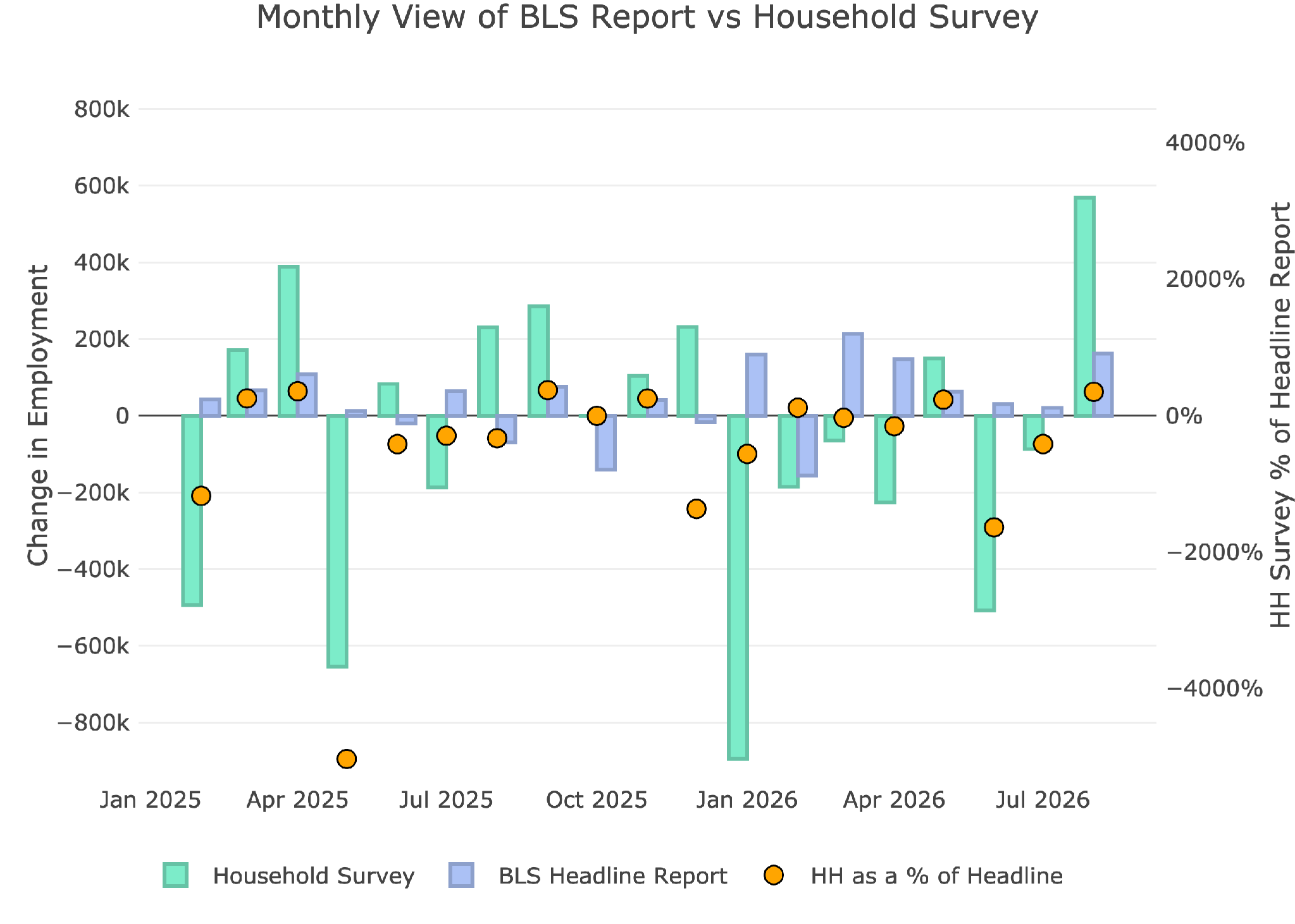
Figure: 1 Primary Report vs Household Survey – Monthly
Despite the massive outperformance in the Household Survey, when looking at the YTD number, it still underperforms. For the year, the Headline Report shows a gain of 643k (80k jobs a month) vs the Household Survey which shows a loss of 1.25M. (-156k per month).
So, even though August was a great month, it was a major outlier. The YTD trend in job growth is extremely weak. Outside of Covid, this is the worst year for jobs since at least 2010.
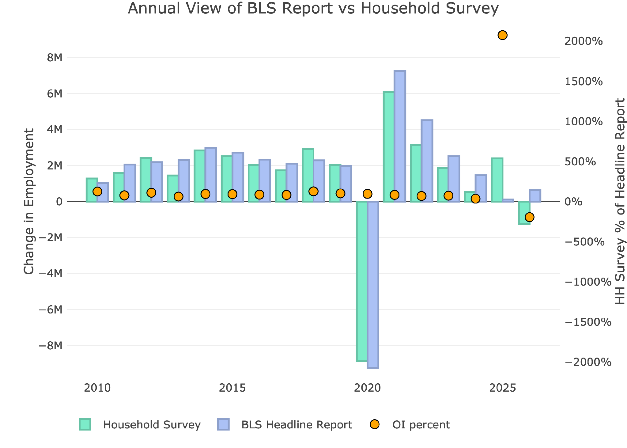
Figure: 2 Primary Report vs Household Survey – Annual
The BLS publishes the data behind their Birth/Death assumptions (formation of new business). The data showed that the BLS assumed a gain of 74k jobs for the month of August. This was fairly small compared to previous months where all the job gains are coming from assumptions.
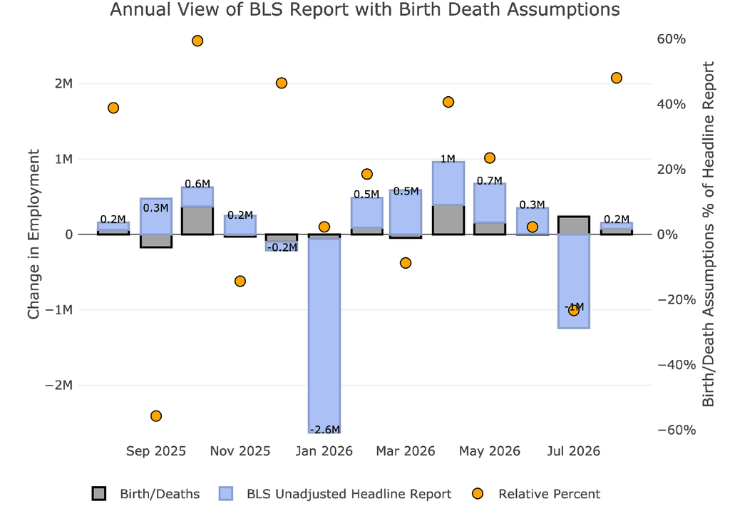
Figure: 3 Primary Unadjusted Report With Birth Death Assumptions – Monthly
We are now in the second year of a situation where assumed births are positive while the actual jobs created are negative. This means that BLS continues to assume job growth through business birth while the rest of the economy sheds jobs. This is the difference between assumed jobs and actual jobs.
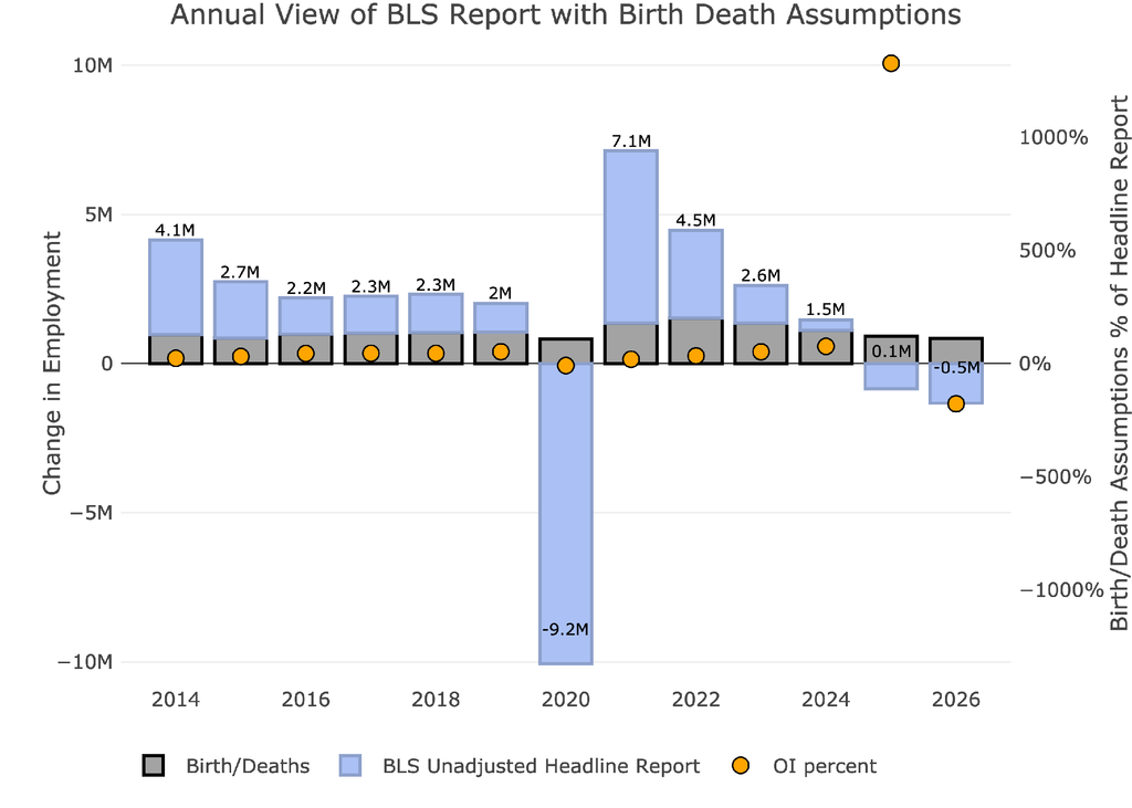
Figure: 4 Primary Unadjusted Report With Birth Death Assumptions – Monthly
The other report released in August is the Quarterly Census of Employment and Wages (QCEW). According to the BLS, this is a far more accurate and rigorous report covering 95% of jobs available at a highly detailed level. Due to the rigor, the report is released quarterly on a several month lag.
The latest report is for Q1 2026. As shown, for each of the three months, the QCEW came in lower than the Headline Report. Again, this is more evidence that the Headline Report is overstating job growth, even after revisions.
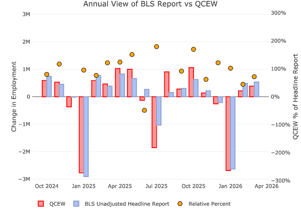
Figure: 5 Primary Report vs QCEW – Yearly
This QCEW data reveals that the economy lost 2M jobs in Q1 of this year. Again, this paints a very ugly picture of how the employment picture is doing. Throw in rising costs across the board, and it creates a very tough spot for a lot of Americans.
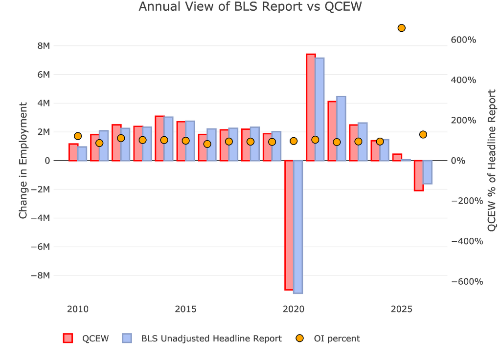
Figure: 6 Primary Report vs QCEW – Yearly
Digging Into the Headline Report
Unfortunately, despite being highly unreliable, the Headline report is the best data we have for the more recent periods. Furthermore, this is the data the Fed uses to shape its policy. Even though Warsh is trying to be more discreet about how the Fed is going to work, the jobs number still holds a lot of weight at the Fed. This is why the market fell on Friday after the release as expectations for a hike increased.
The unemployment rate remained unchanged at 4.1%.
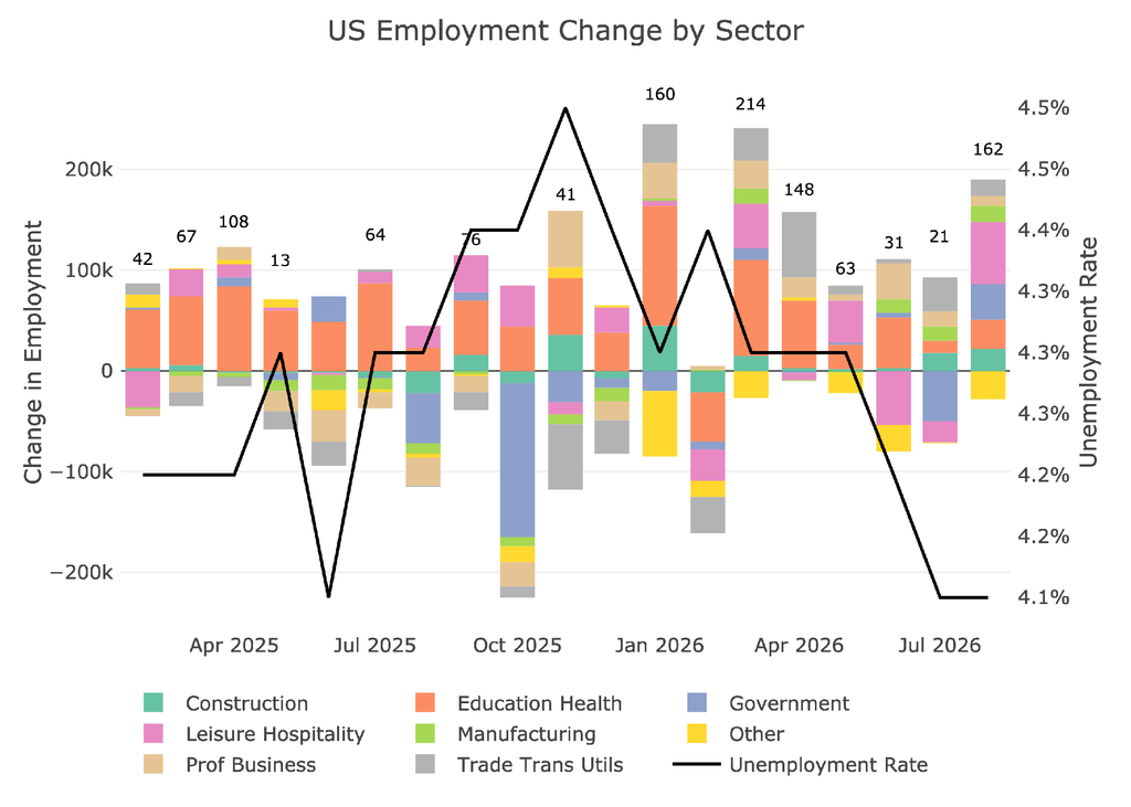
Figure: 7 Change by sector
Jobs by Category
Across the 8 job categories tracked in the headline report, 5 of them showed as being above the 12 month trend. Leisure and Hospitality, Government, and Education led the way. These are not the types of jobs for growing an economy unfortunately.
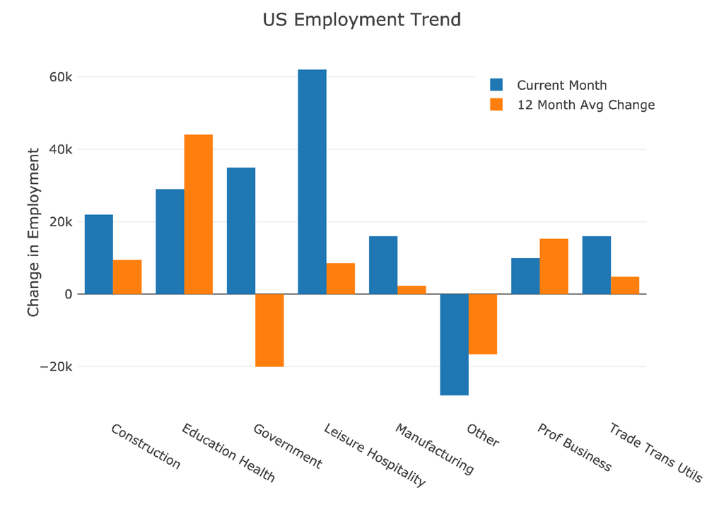
Figure: 8 Current vs TTM
The table below shows a detailed breakdown of the numbers.
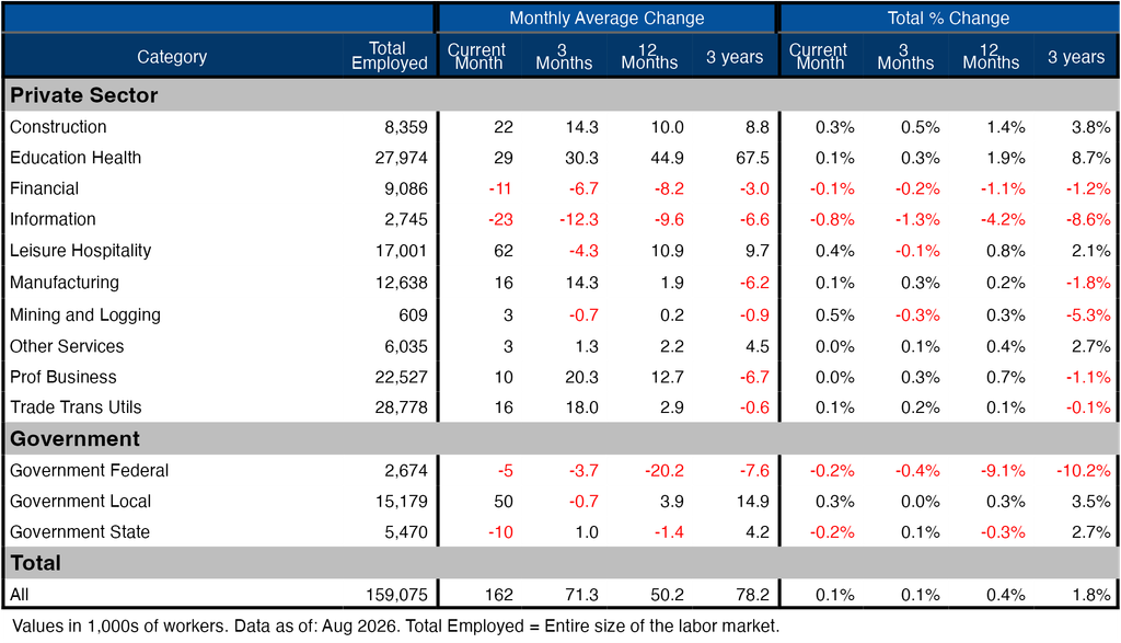
Figure: 9 Labor Market Detail
Revisions
This has been one of the biggest stories of the jobs report each month. The Headline Report has been constantly revised with big changes in the months following the release. While the latest month of July was revised upward, the two months prior to that were both revised downward with May being cut by nearly two-thirds.
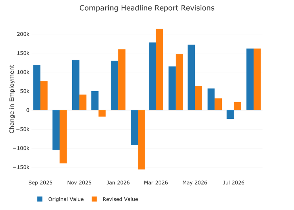
Figure: 10 Revisions
Over the last twelve months, jobs have been revised down by about 48k per month!
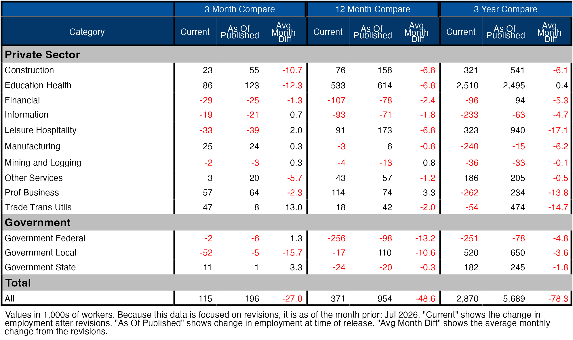
Figure: 11 Revisions
More Detail in the Household Survey
Another level of detail in the Household report shows full-time vs part-time job holders. The data shows full-time jobs being gained for the first time in 4 months.
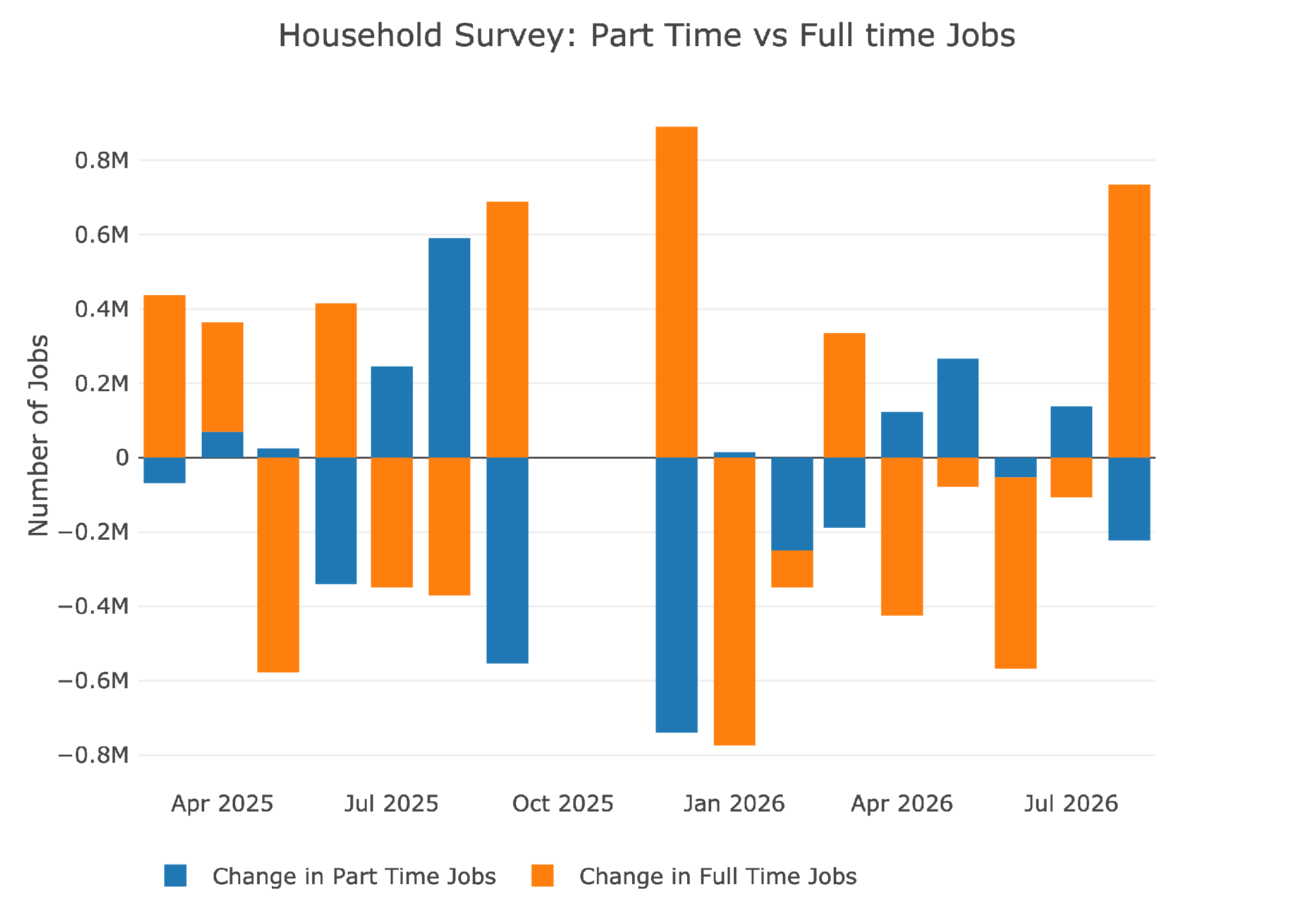
Figure: 12 Full Time vs Part Time
Historical Perspective
The chart below shows data going back to 1955.
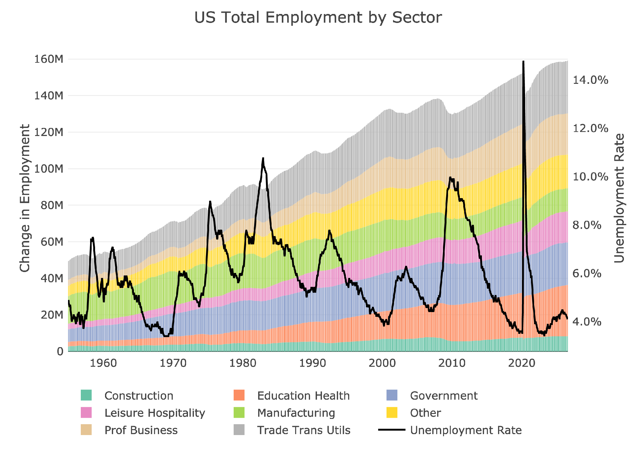
Figure: 13 Historical Labor Market
The labor force participation rate is still well below the highs before the Global Financial Crisis. This month showed it moving up from 61.4% to 61.6%. It is good to see a move up but it is still well below where it should be.
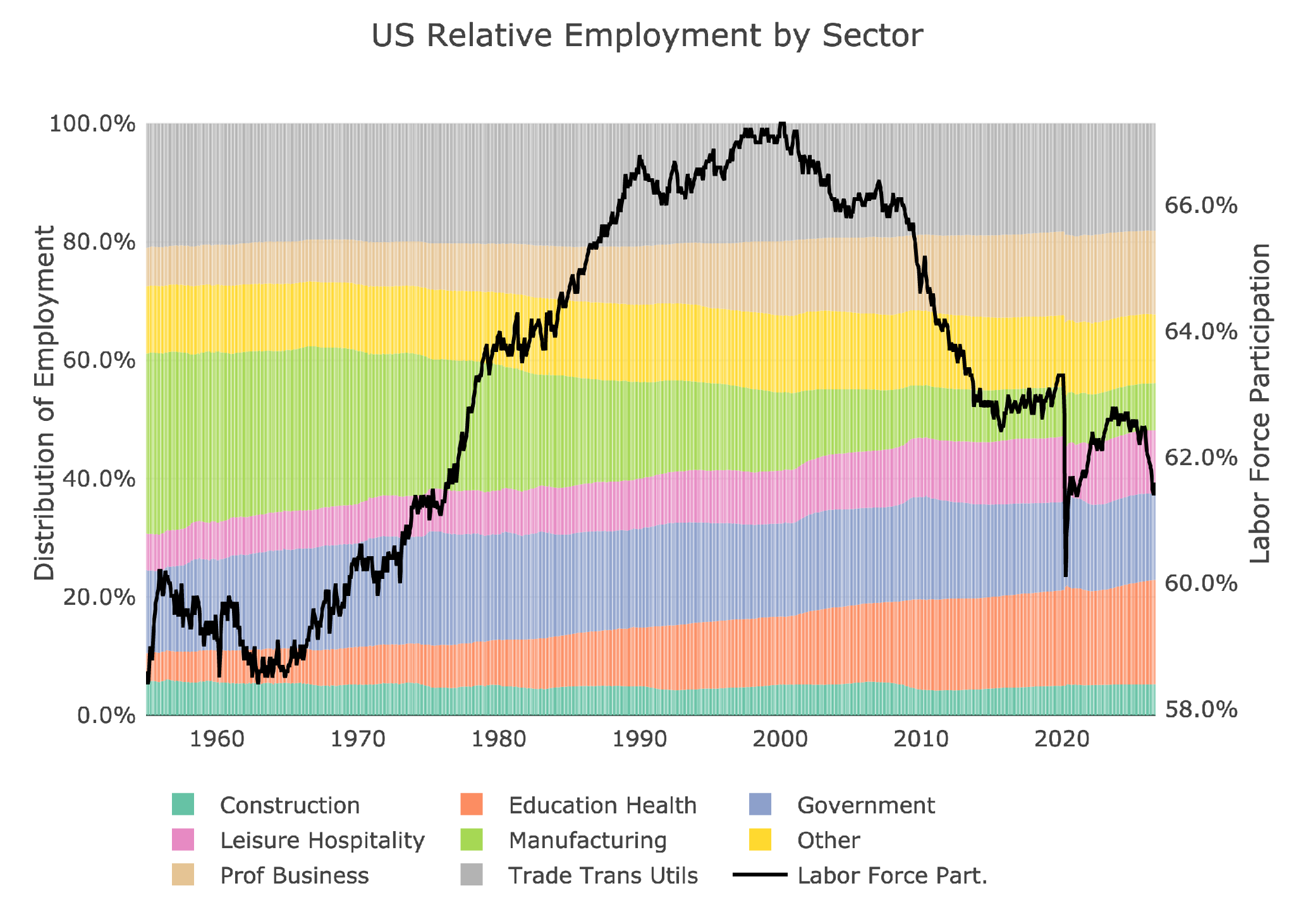
Figure: 14 Labor Market Distribution
Conclusion
The recent job report was an upside surprise for both the Headline Number and Household Survey. However, it does not change the fact that:
- The YTD numbers are still very weak
- The QCEW report of Q1 is nothing short of horrific
- Revisions continue to be made overwhelmingly down rather than up
- Inflation is still destroying purchasing power as wages fail to keep up
The Fed may use these numbers to raise rates, especially if the Friday CPI report comes in even a touch hot. However, the Fed is also lying to themselves if they think this job report paints a bullish picture of the US Economy.

 Live Chat
 Email:
  Phone: 1-888-465-3160