
Government Spending has Increased 89% since 2016 to $7.2T
Federal Budget
The Federal Government publishes the spending and revenue numbers on a monthly basis. The charts and tables below give an in depth review of the Federal Budget, showing where the money is coming from, where it is going to, and the surplus or deficit.
The government fiscal year closes at the end of September, but this analysis will look at the calendar year budget. As shown below, 8 of the last 9 months showed an almost $100B deficit. The only non-deficit month was the tax month of April.
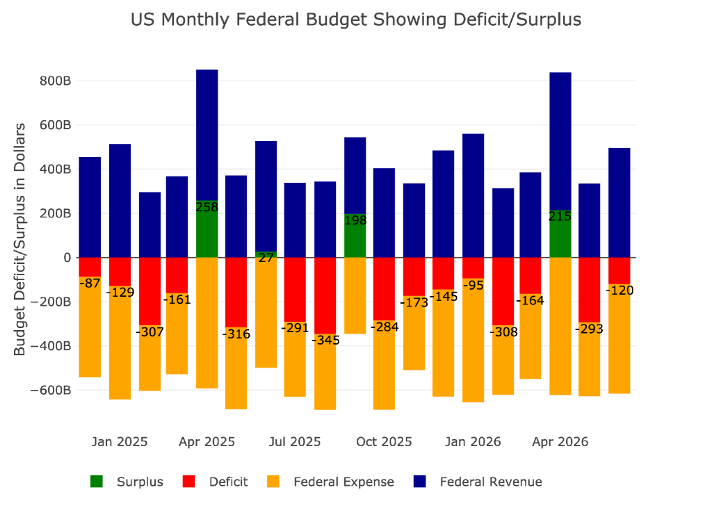
Figure: 1 Monthly Federal Budget
Looking at the average monthly deficit, May and June were both worse than average where April was a slightly higher surplus than average.
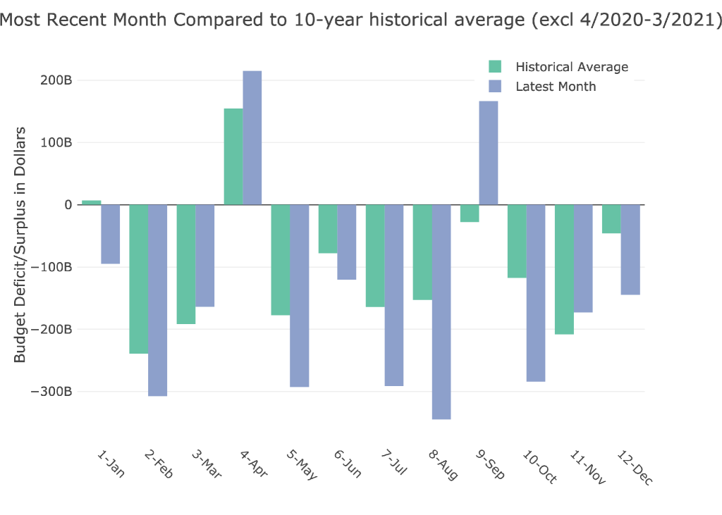
Figure: 2 Current vs Historical
We can look at the quarter in aggregate using the Sankey diagram below that shows the very large $198B deficit in the quarter that should be the best of the year because of the April surplus.
The big concern with the chart below is how much Interest Expense has moved up, making up 16.5% of all spending in Q2. This is now the second largest line item behind only Social Security. This is how debt spirals work. When interest becomes a massive burden on the budget, it does not bode well.
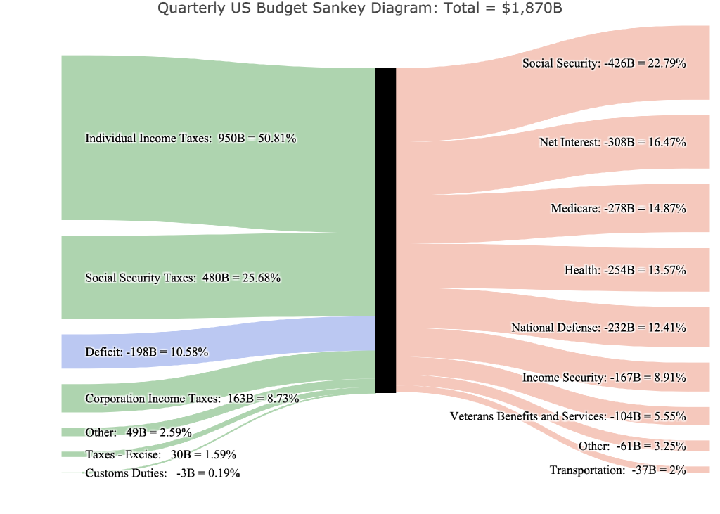
Figure: 3 Quarterly Federal Budget Sankey
As mentioned above, Q2 is usually the best quarter of the year because of the April tax month. Last year, the Q2 deficit was only $30B. This year, the quarterly deficit was 6.6x larger than it was last year. That is a really bad sign.
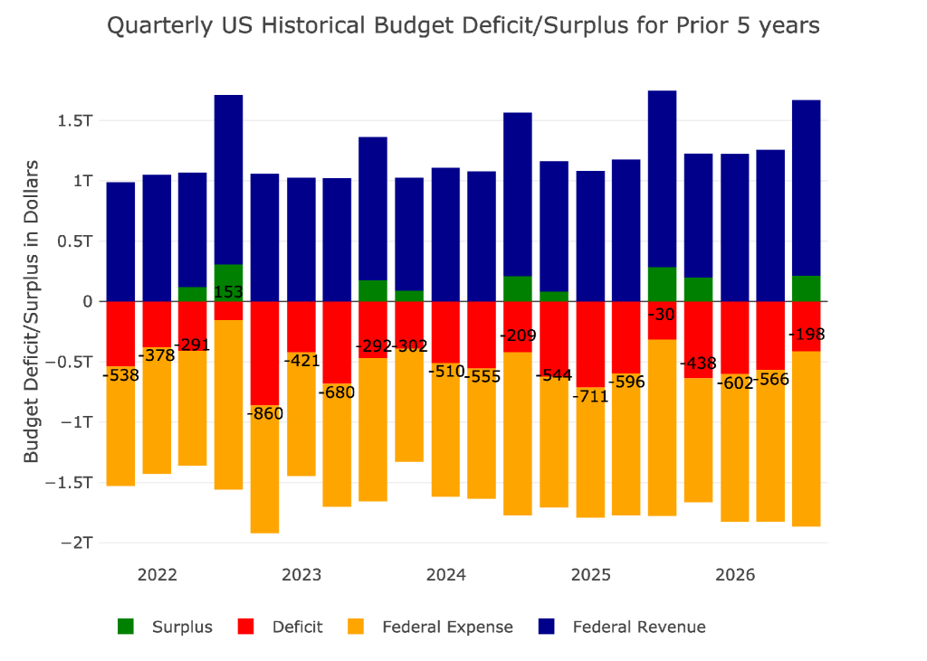
Figure: 4 Quarterly Historical Deficit/Surplus for Previous Five Years
The next two charts show the quarterly revenue and costs broken down by expense type. You can see how the revenue this year is actually smaller than the revenue last year for Q2. The big driver was tariff revenue, but social security was actually slightly down this year.
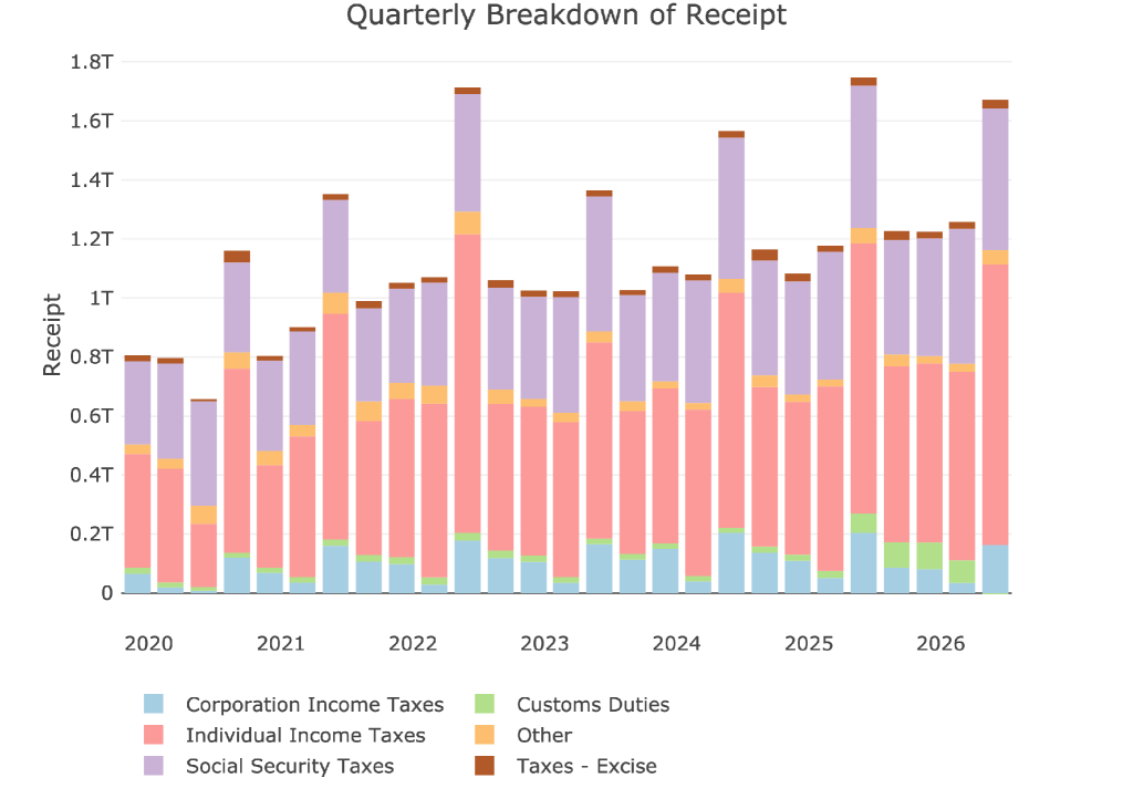
Figure: 5 Quarterly Receipts
On the flip side, you can see that spending continues to creep higher with no clear driver. It is just an increase in spending across the board… which is the hardest spending to combat.
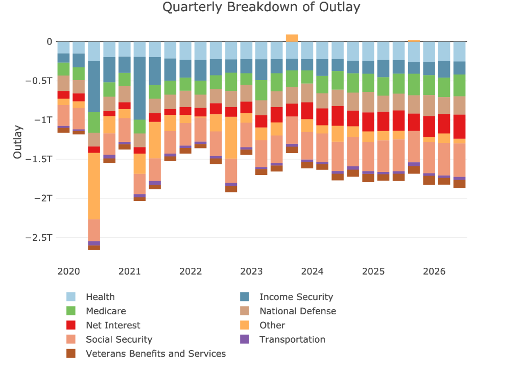
Figure: 6 Quarterly Outlays
Interest Expense has ballooned higher to $1.04T on a trailing twelve month basis. This is deadly for the budget. With the Fed unable to lower rates because of the elevated inflation, this leaves little relief in sight for interest expense.
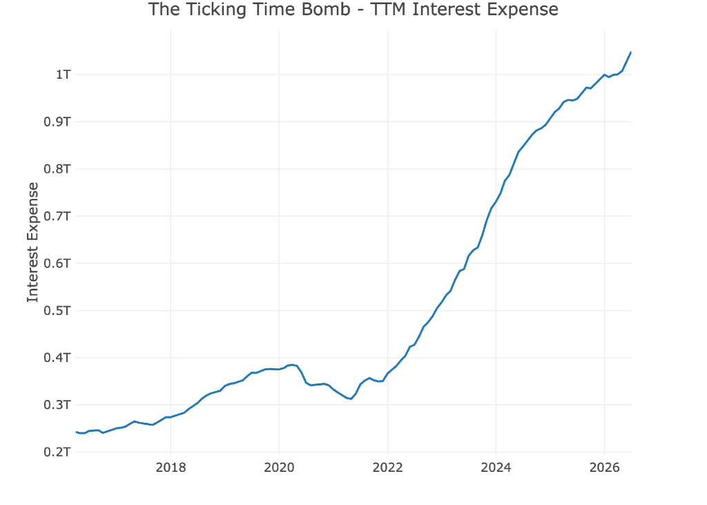
Figure: 7 TTM Interest Expense
Historical Perspective
Zooming out and looking over the history of the budget back to 2015 shows a more complete picture. The change since Covid is quite dramatic. In 2019, the deficit was $1.02T. As of June last year, it was $1.88T. Ironically, the most recent TTM is slightly smaller at $1.8T deficit.

Figure: 8 Trailing 12 Months (TTM)
The next two charts zoom in on the recent periods to show the change when compared to pre-Covid. These charts show spending and revenue on a trailing 12 month basis period over period.
The last 12-months was a record revenue number at $5.38T. Tariffs directly contributed $250B, so as Tariff revenue dries up, the budget deficits are only going to get worse.
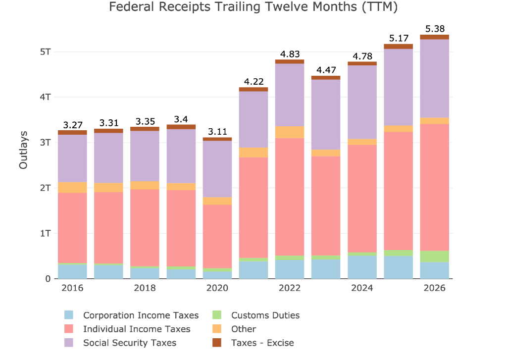
Figure: 9 Annual Federal Receipts
The spending chart really shows the impact of the growing interest expense. You can see how the red bar really starts to expand, but the same can be said for almost every other spending item.
Bottom line, in 10 years spending has grown 89% while revenue has grown 64%. That is not a great formula.
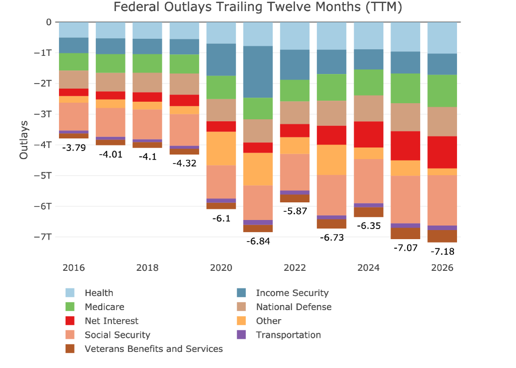
Figure: 10 Annual Federal Expenses
Finally, we finish with a Sankey showing TTM Deficit was -$1.8T which is a massive issue going forward, representing 25% of all government spending. The government cannot afford to keep printing such massive debt figures.
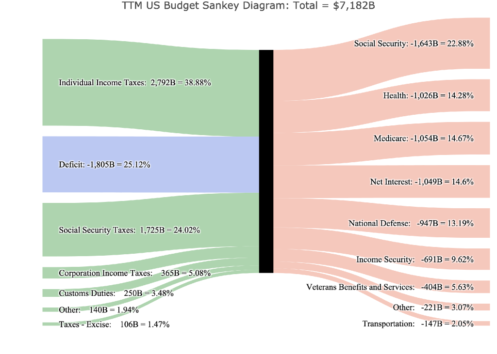
Figure: 11 TTM Federal Budget Sankey

 Live Chat
 Email:
  Phone: 1-888-465-3160