
13 Week Money Supply Growth Reaches 6.5%
Money Supply is a very important indicator. It helps show how tight or loose current monetary conditions are regardless of what the Fed is doing with interest rates. Even if the Fed is tight, if Money Supply is increasing, it has an inflationary effect.
One key metric shown below is the “Wenzel” 13-week annualized money supply figure. It was made popular by the late Robert Wenzel who tracked the metric weekly as an indicator for where the economy might be headed. In 2020, the Fed started reporting the data monthly instead of weekly. It should also be noted that Money Supply data can be heavily revised in future months.
Recent Trends
Seasonally Adjusted Money Supply has been growing on a consistent monthly basis since November 2023 (26 straight months). The latest month (December) showed a modest increase of $89B, the third largest increase since April. The continued growth in money supply is inflation. The rising prices are an after effect of this money growth. Fed Chair Powell seems oblivious to this fact as he said he has no concern over the rapid rise in gold prices.
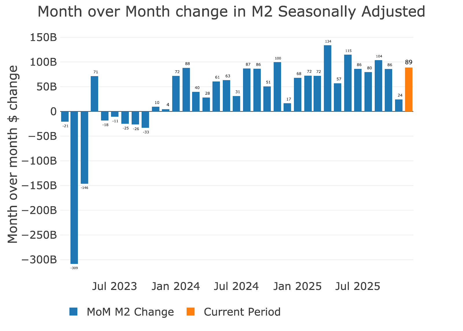
Figure: 1 MoM M2 Change (Seasonally Adjusted)
The increase was 4.9% annualized, which is above the 4.6% over the past year.

Figure: 2 M2 Growth Rates
December average is typically around 5.5%, which puts the latest month somewhat below average.
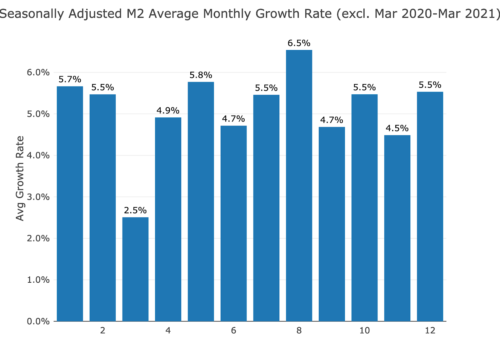
Figure: 3 Average Monthly Growth Rates
Non-seasonally adjusted shows positive growth for the month of December and January (note: this data is ahead of the seasonally adjusted data above). December was the strongest month since March.
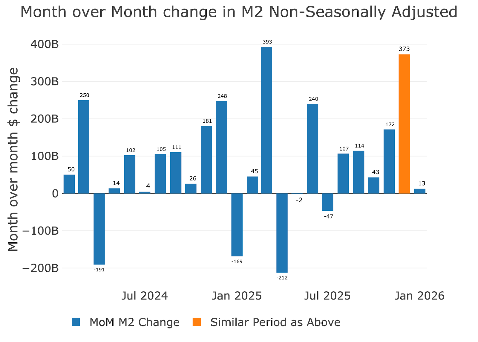
Figure: 4 MoM M2 Change (Non-Seasonally Adjusted)
The weekly data shows 6 consecutive weeks of positive money supply growth which is the first time that has happened since January of 2025.
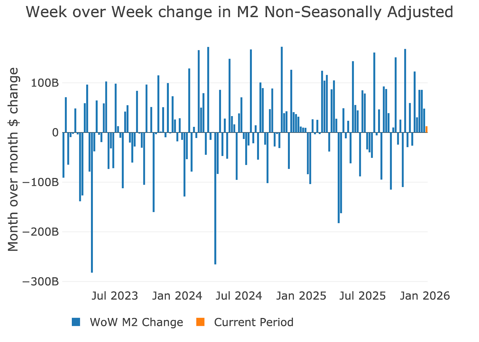
Figure: 5 WoW M2 Change
The “Wenzel” 13-week Money Supply
The late Robert Wenzel of Economic Policy Journal used a modified calculation to track Money Supply. He used a trailing 13-week average growth rate annualized as defined in his book The Fed Flunks. He specifically used the weekly data that was not seasonally adjusted. His analogy was that in order to know what to wear outside, he wants to know the current weather, not temperatures that have been averaged throughout the year.
The objective of the 13-week average is to smooth some of the choppy data without bringing in too much history that could blind someone from seeing what’s in front of them. The 13-week average growth rate can be seen in the table below.
Growth decelerated for 3 weeks, 2 months ago but has now been accelerating for 7 straight weeks. Growth has reached 6.5% annualized which is the highest rate in a year.



Figure: 6 WoW Trailing 13-week Average Money Supply Growth
The plot below shows how the latest year compares with previous years. Since we are at the start of a new year, it is hard to see where the trend is going. 2025 stayed right in the middle of the range the entire year. It seems doubtful 2026 will do the same with a new Fed chair set to be appointed.
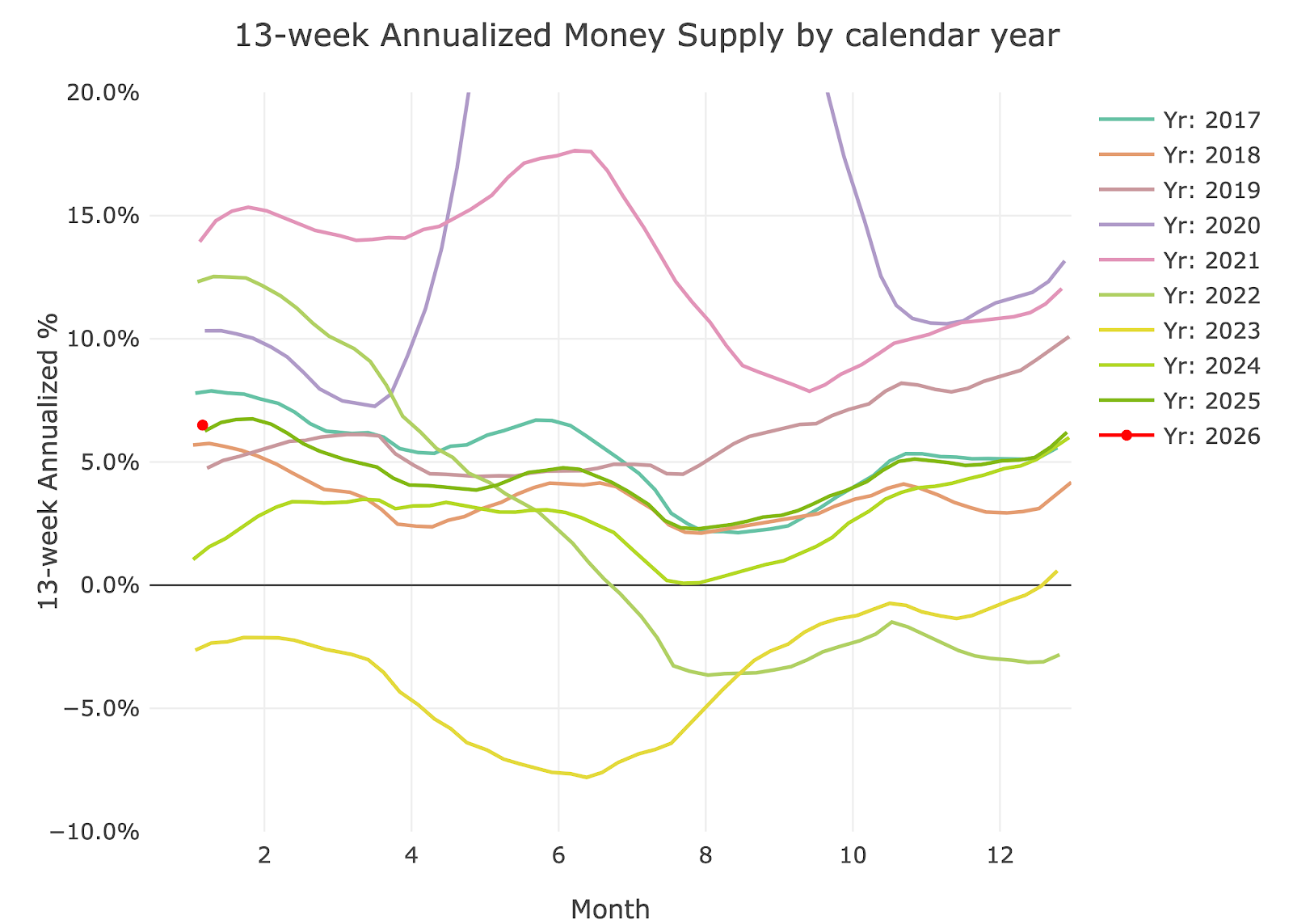
Figure: 7 Yearly 13-week Overlay
Inflation and Money Supply
The chart below shows the history of inflation, Money Supply, and Fed Funds. As shown, in 1970 inflation worked with a ~2 year lag compared to Money Supply. Money Supply slowed dramatically in 2023 and 2024 but has been moving back up. Inflation has also been stickier than the Fed would like, but unfortunately, they cannot do much given the large debt load of the US Government and Corporations. Despite inflation staying elevated, even moving up in the recent period, the Fed has no choice but to continue lowering rates.
The inflation rate is now only 1% below the fed funds rate. That is not a big enough gap to slow inflation, especially when the money supply is still expanding. Expect prices to continue rising in the years ahead and the Fed to only fan the flames.
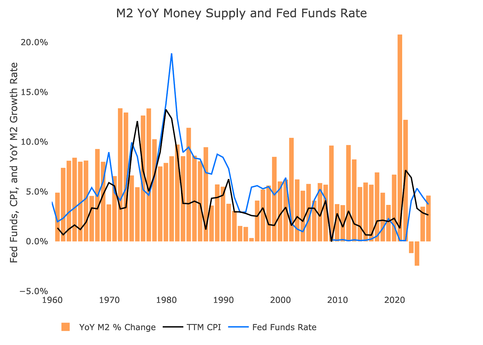
Figure: 10 YoY M2 Change with CPI and Fed Funds
Historical Perspective
The charts below are designed to put the current trends into historical perspective. The orange bars represent annualized percentage change rather than raw dollar amount.
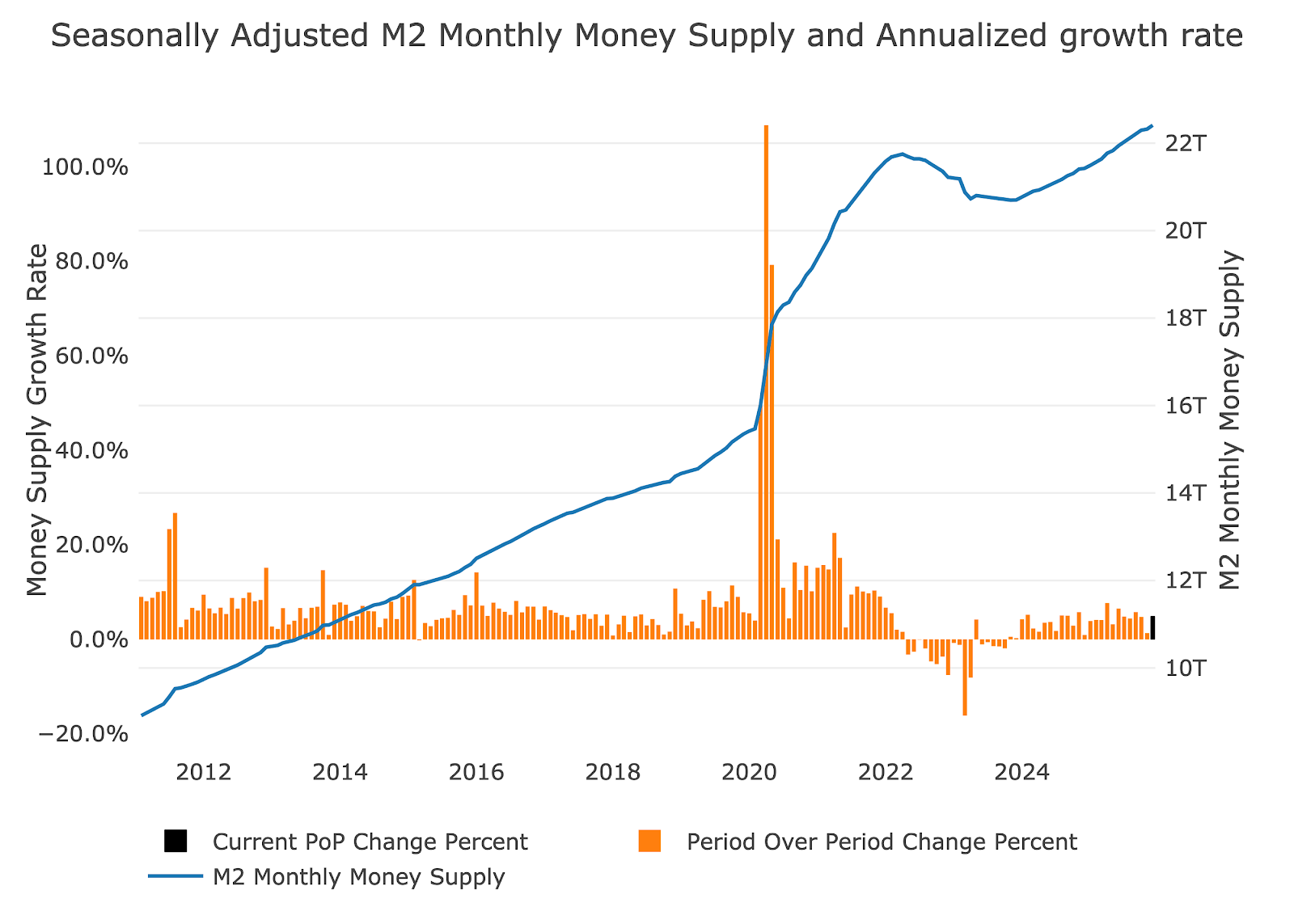
Figure: 9 M2 with Growth Rate
Below shows the 13-week annualized average over history. This chart overlays the log return of the S&P. Mr. Wenzel proposed that large drops in Money Supply could be a sign of stock market pullbacks. His theory, derived from Murray Rothbard, states that when the market experiences a shrinking growth rate of Money Supply (or even negative) it can create liquidity issues in the stock market, leading to a sell off.
While not a perfect predictive tool, many of the dips in Money Supply precede market dips. Specifically, the major dips in 2002 and 2008 from +10% down to 0%. 2022 was highly correlated with a fall in Money Supply and the rebound has corresponded with the big stock market move we saw in 2023 and into 2024. The slowing growth in 2025 did correlate with the market drop in March/April, but that was clearly more headline driven. With money growth continuing to climb, it seems to be providing enough fuel to keep pushing the market higher. The November market correction was shallow since the money supply remained elevated
Please note the chart only shows market data through Jan 5th to align with available M2 data.
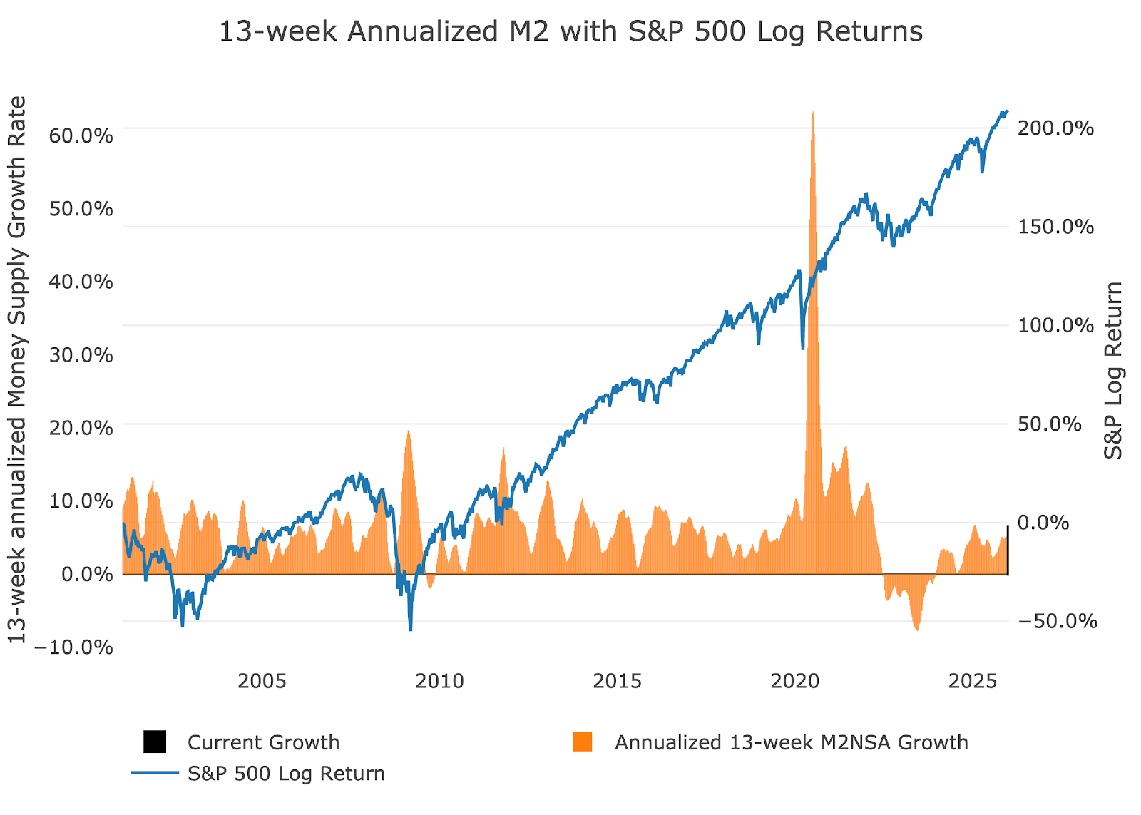
Figure: 10 13-week M2 Annualized and S&P 500
One other consideration is the reverse repo market at the Fed. This is a tool that allows financial institutions to swap cash for instruments on the Fed balance sheet.
Reverse Repos peaked at $2.55T on Dec 30, 2022. Money gushed out from March 2023 to May 2024. The outflows have yet to return which is likely driving the continued money supply growth.
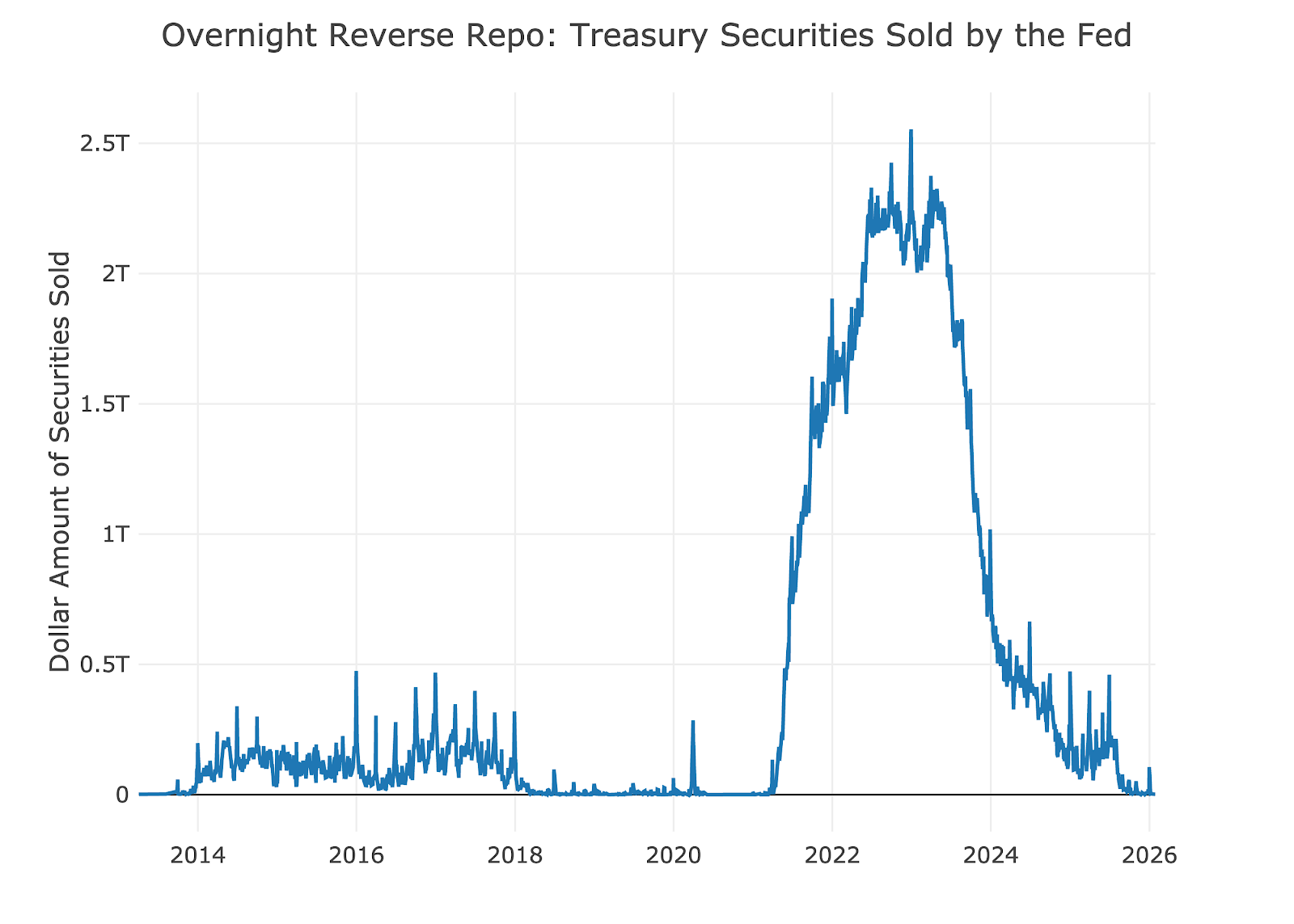
Figure: 11 Fed Reverse Repurchase Agreements
Wrapping Up
Inflation is truly defined as the expansion of the money supply which generally leads to higher prices. Gold did not reflect this for over a decade but is now playing catchup. It is the canary in the coal mine and it is saying that things have finally gotten out of control. Although this was obvious for years, it is coming to a head rather quickly. The growth in money supply for decades is the support driving gold higher. The metal decided to move all at once instead of doing it in an orderly fashion like the money supply expansion.

 Live Chat
 Email:
  Phone: 1-888-465-3160