
Fed is Adding $20B a Month to the Balance Sheet
The following analysis breaks down the Fed balance sheet in detail. It shows different parts of the balance sheet and how those amounts have changed. It also shows historical interest rate trends.
Breaking Down the Balance Sheet
As soon as the Fed ended Quantitative Tightening, they launched a new round of Quantitative Easing. As shown in the chart below, the Fed has added $60B in assets over the last 3 months. Ignoring the Reverse Repos shows that the Fed is consistently adding about $20B a month in assets. The Fed promised this would be focused in short-term debt and so far, they have stuck to that promise (see light blue bars).
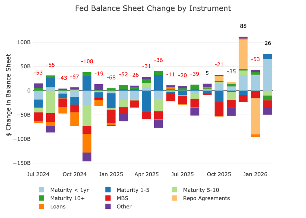
Figure: 1 Monthly Change by Instrument
Zooming out to 10 years and grouping the data by year shows the chart below. What you should notice is how quickly the Fed will un-do all the “hard work” in reducing the balance sheet during the next crisis. It took 4 years to reduce the balance sheet about $2.2T. However, in 2020, it took a few months to grow the balance sheet by $3T and 2 years to grow it by $4.5T.
The new presumptive Fed Chair Warsh has said that he does not like the use of the Fed balance sheet. Unfortunately, he will likely find it far harder to shrink than he would like. The only reason 2026 is showing as negative is the reduction of Reverse Repos in January.
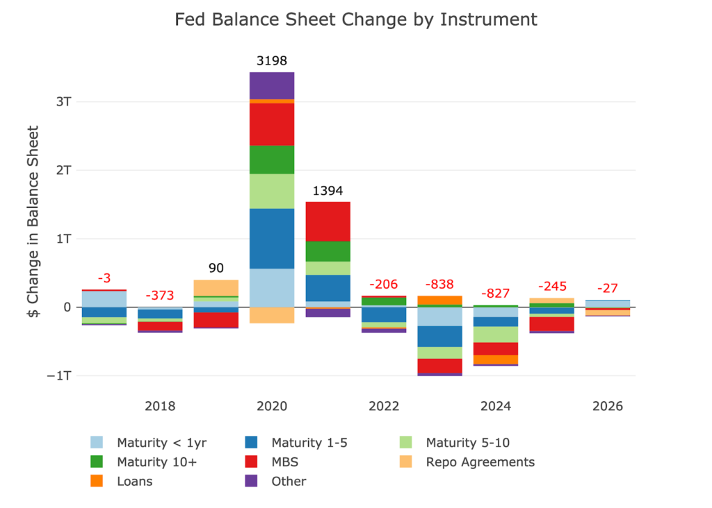
Figure: 2 Monthly Change by Instrument
The table below provides more detail on the Fed’s activities and its recent efforts to shrink the balance sheet. With QE already resuming, the Fed will be taking a $6.6T balance sheet (and growing) into the next crisis, almost guaranteeing that it will exceed $10T when it fully goes back to QE. Warsh may not like QE, but he will have no choice if he wants to keep the bubble inflated.
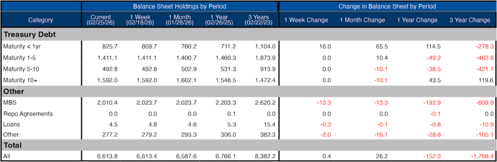
Figure: 3 Balance Sheet Breakdown
The weekly activity can be seen below. As shown, the Repo agreements were used but then were just as quickly eliminated. According to the Fed, it is not being used as much as they would like to see.
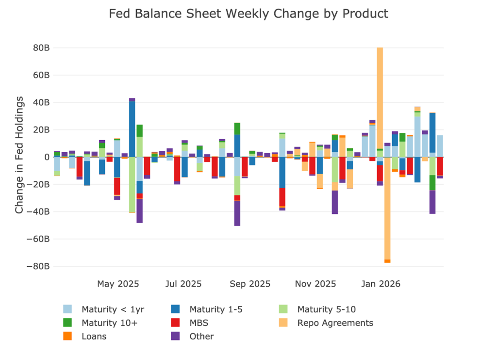
Figure: 4 Fed Balance Sheet Weekly Changes
The chart below shows the balance on detailed items in Loans and also Repos. These were the programs set up in the wake of the SVB collapse. All of the programs have dropped down to zero at this point, but as mentioned above, the Fed would like to see more usage of the Repo market (Standard Repo Facility or SRF).
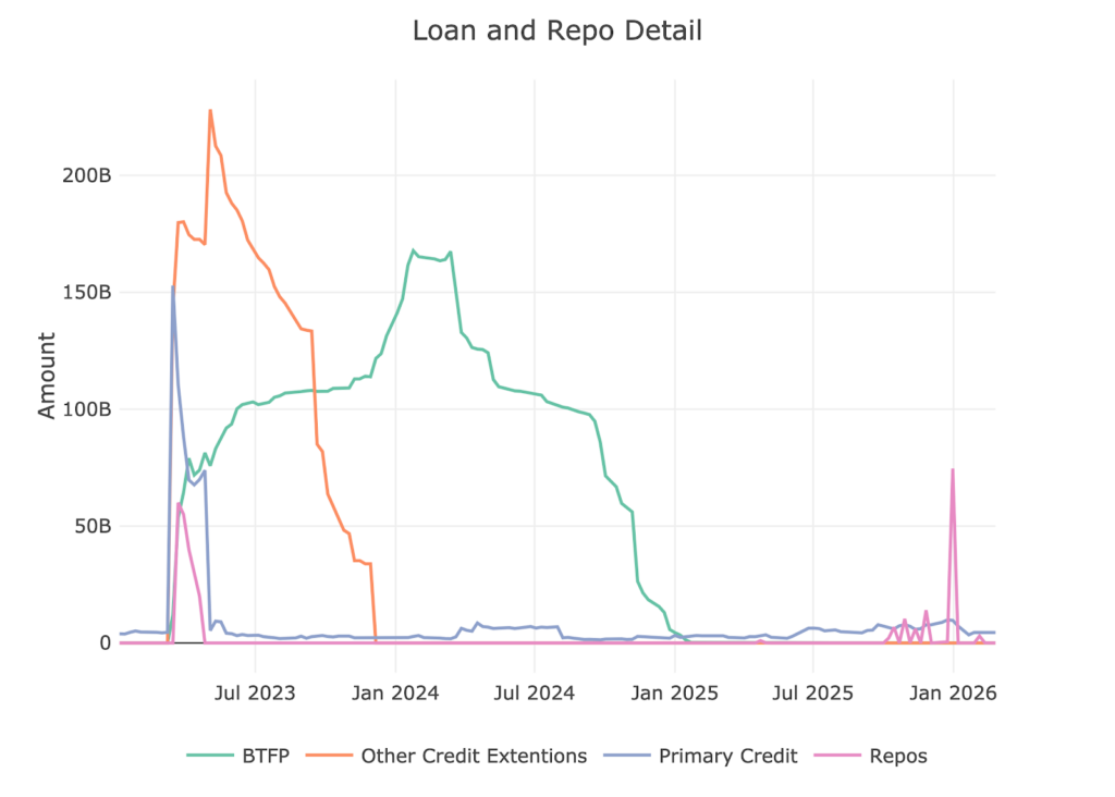
Figure: 5 Loan Details
Yields
Yields have been fluctuating within a band since Sept 2022, ranging mostly between 3.25% and 4.75%. The range of rates has begun to widen in recent months and the yield curve takes on a more normal shape.
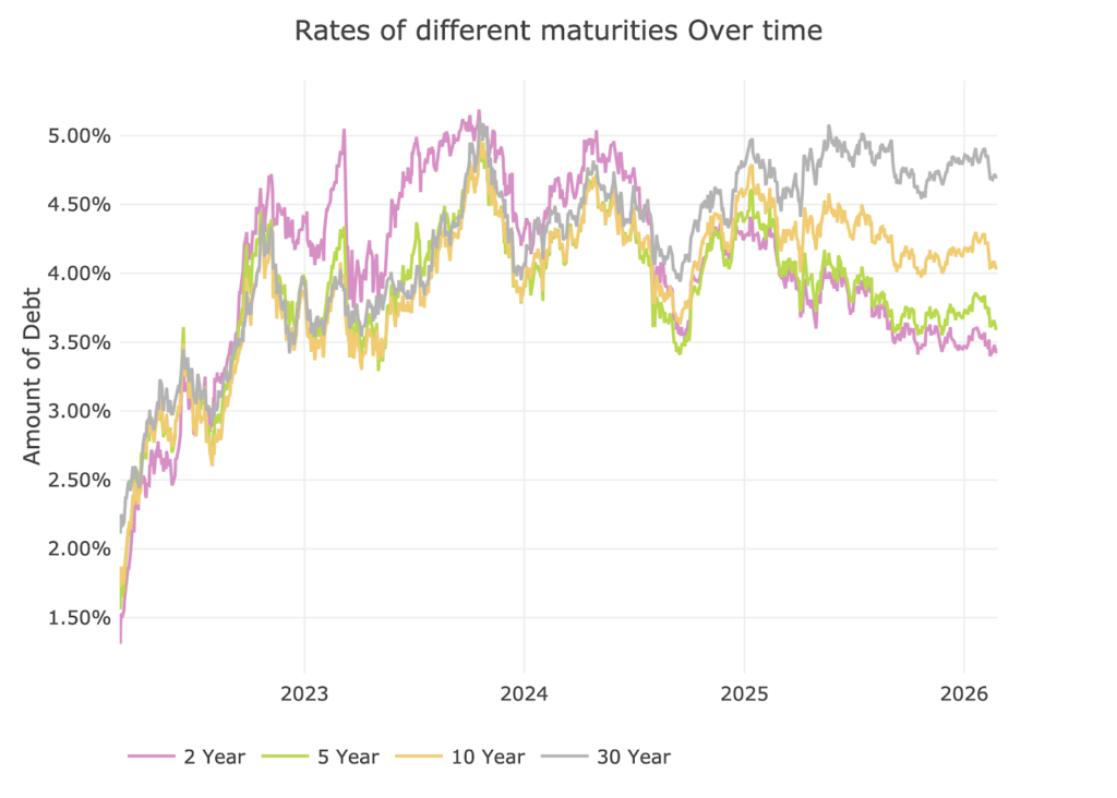
Figure: 6 Interest Rates Across Maturities
This normalization of the yield curve can be seen in the chart below. The spread between the 2 year and 10 year continues to move up. This does not mean a recession is no longer likely because the inverted yield curve can work on a significant lag.
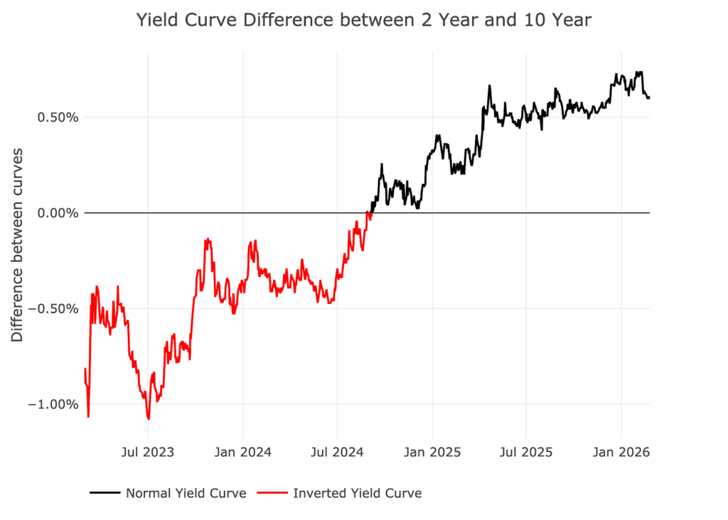
Figure: 7 Tracking Yield Curve Inversion
The chart below shows the current yield curve, the yield curve one month ago, and one year ago. The long end has stayed steady while the short end has come down, steepening over the last year. This could be a result of the Fed intervening on the short-end of the curve.
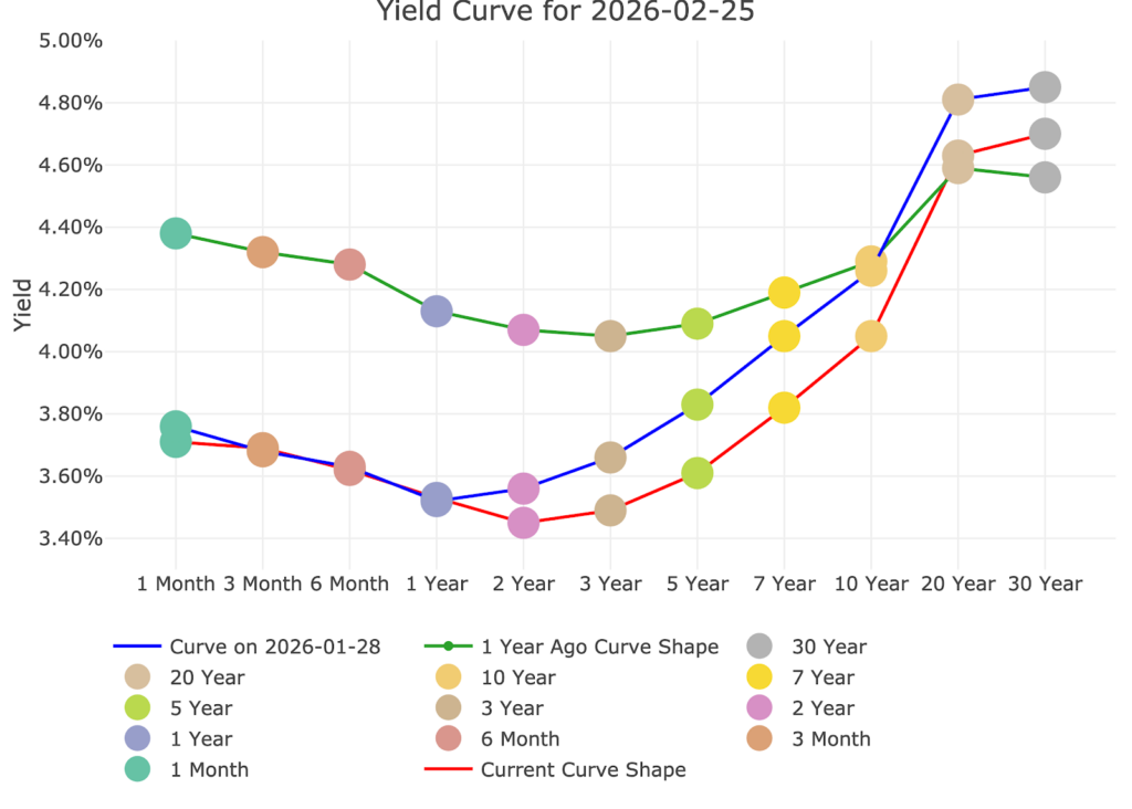
Figure: 8 Tracking Yield Curve Inversion
The Fed Takes Losses
When the Fed makes money, it sends it back to the Treasury. This has netted the Treasury close to $100B a year. This can be seen below.
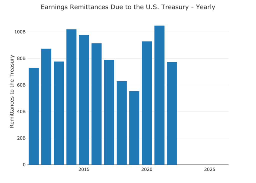
Figure: 9 Fed Payments to Treasury
You may notice in the chart above that 2023-2025 are showing $0. That’s because the Fed has been losing money. According to the Fed: The Federal Reserve Banks remit residual net earnings to the U.S. Treasury after providing for the costs of operations… Positive amounts represent the estimated weekly remittances due to U.S. Treasury. Negative amounts represent the cumulative deferred asset position … deferred asset is the amount of net earnings that the Federal Reserve Banks need to realize before remittances to the U.S. Treasury resume.
Basically, when the Fed makes money, it gives it to the Treasury. When it loses money, it keeps a negative balance by printing the difference. That negative balance has exceeded $245B, but has started to flatten out in recent months.
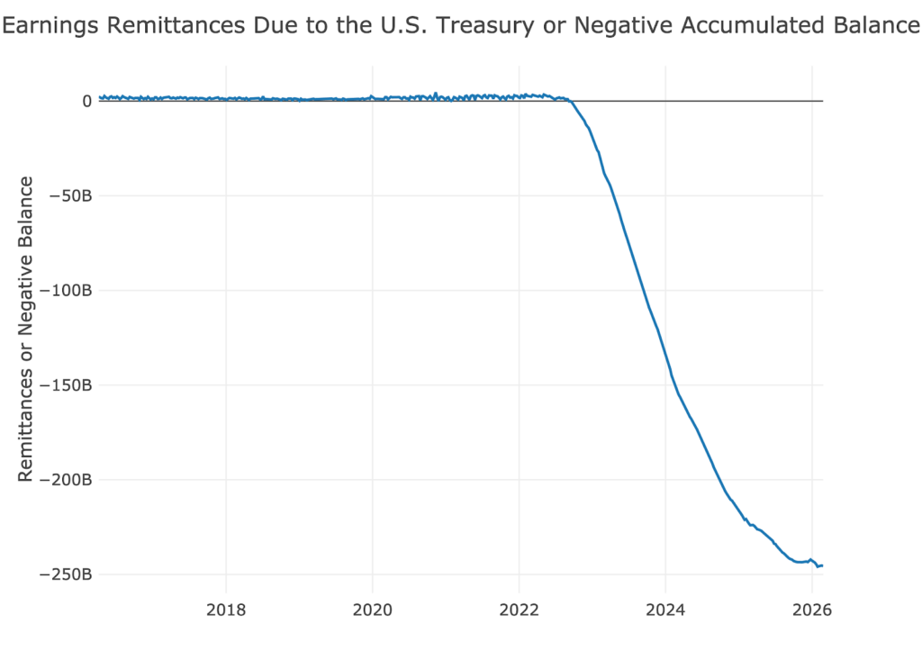
Figure: 10 Remittances or Negative Balance
Who Will Fill the Gap?
The Fed has not been buying in the Treasury market since 2022 (they have been selling); however, the Treasury is still issuing tons of new debt. Who has been picking up the slack since the Fed stepped away?
International holdings have increased a decent amount since 2022, rising by $2T. Unfortunately, this pales in comparison to the amount of debt issued by the Treasury overall which is closer to $8.4T. Furthermore, the chart below shows that foreign balances are quite flat over the last 6 months. If the rest of the world stops buying the US debt, it could foreshadow major issues in the months and years ahead.
Note: data is updated on a lag. The latest data is as of December
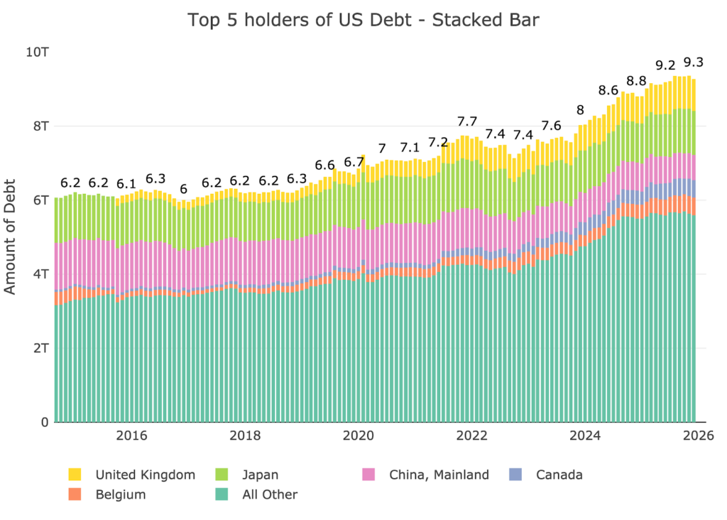
Figure: 11 International Holders
The chart below shows a breakdown of the bigger countries. China US Debt holdings has fallen to $680B. The rest of the countries have all added over the last year, but as shown in the chart above, that motion has stopped over the last few months.
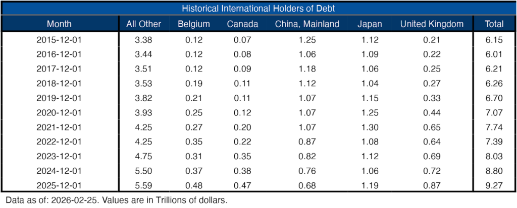
Figure: 12 Average Weekly Change in the Balance Sheet
Historical Perspective
The final plot below takes a larger view of the balance sheet. It is clear to see how the usage of the balance sheet has changed since the Global Financial Crisis. This also highlights the rapid increase and steady decrease. The Fed can never actually shrink its balance sheet back to the previous state, it just does minor reductions when it can before the next crisis blows it up again.
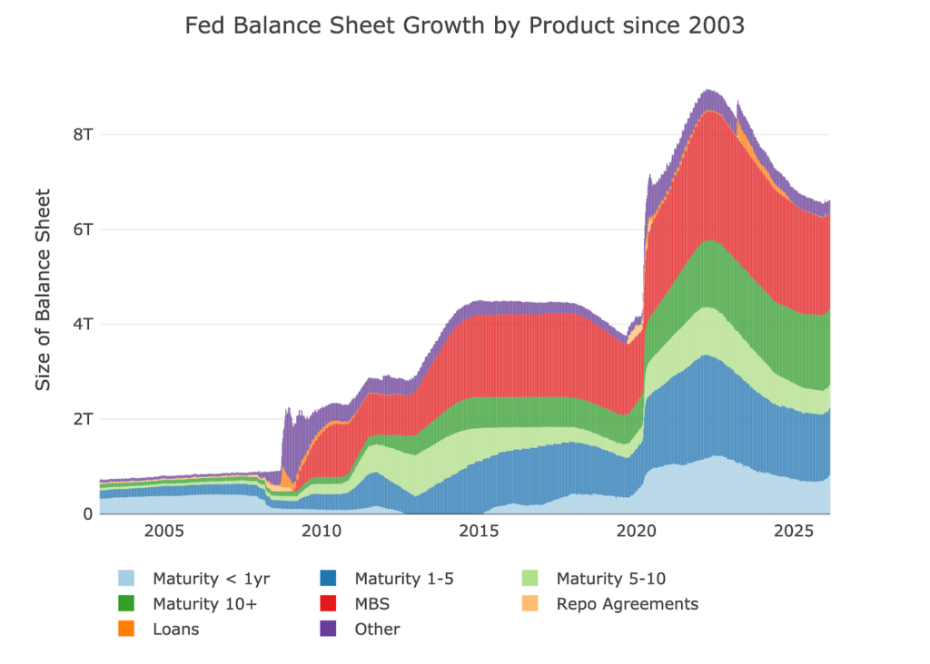
Figure: 13 Historical Fed Balance Sheet
Conclusion
While prior communication from Warsh indicates he does not like the use of the Fed balance sheet, there has been no official communication on the topic since he was nominated as next Fed chair. Right now, the theory is that he will lower short-term rates in an effort to stimulate AI productivity gains, which should in turn keep downward pressure on the long end of the curve. This is a very dangerous game to play. If the productivity gains are not realized, the Fed stays out of buying on the long end of the curve, and international holders keep holdings steady, the Treasury could see their borrowing costs move up substantially. This would be devastating to a budget that is already under immense strain from interest payments.

 Live Chat
 Email:
  Phone: 1-888-465-3160