
Household Survey Shows 1.8M Jobs Lost in 2026 so far
The analysis below covers the Employment picture released on the first Friday of every month. While most of the attention goes to the Headline Report, it can be helpful to look at the details, revisions, and other reports to get a better gauge of what is really going on.
Current Trends
The jobs report showed a loss of 23k jobs for the month of July. This was a surprise to the market which had been expecting an increase in jobs. Even worse was the Household Survey which showed a loss of 87k jobs.
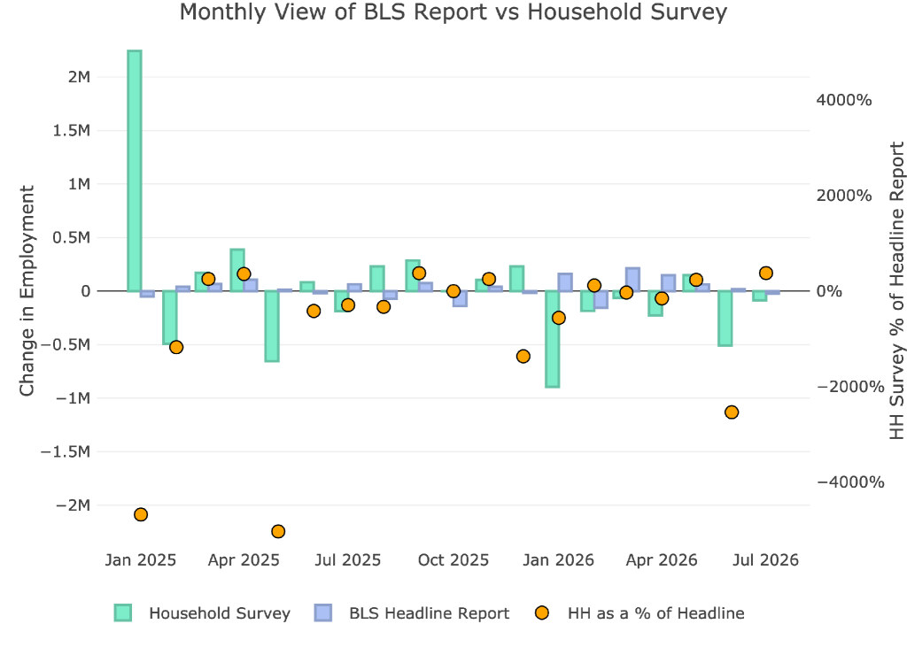
Figure: 1 Primary Report vs Household Survey – Monthly
When looking at the yearly numbers, the Household Survey paints an even worse picture. While the Headline Report shows a gain of 426k, the Household Survey shows a loss of 1.8M. That is a massive difference exceeding 2.2M! While the Headline Report paints a weak picture of the US economy, the Household report is showing one already deep in recession.
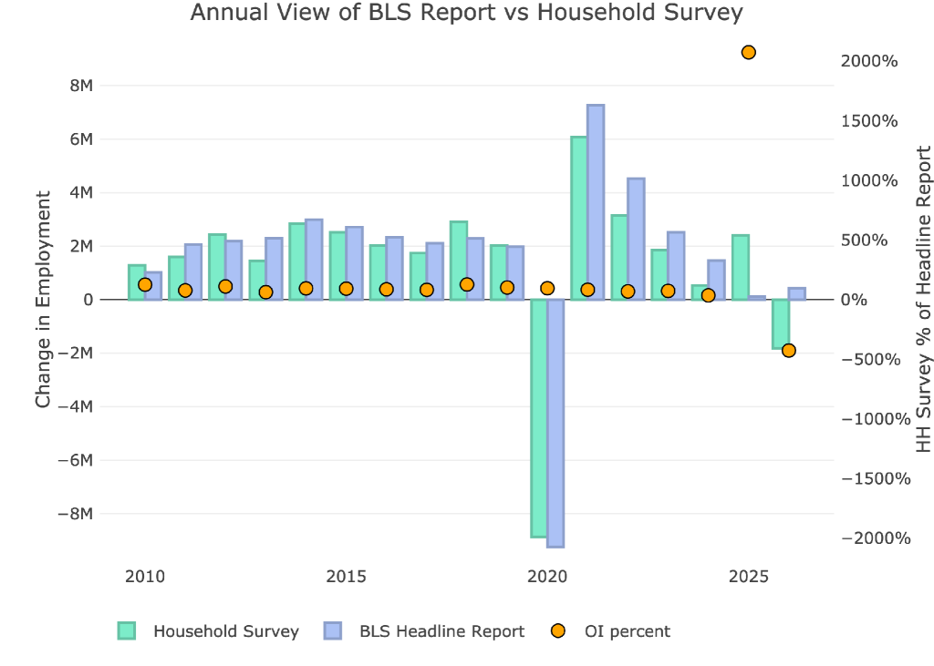
Figure: 2 Primary Report vs Household Survey – Annual
The BLS publishes the data behind their Birth/Death assumptions (formation of new business). The data showed that the BLS assumed a gain of 235k jobs for the month of July. With the total adjusted number still negative, it shows that even with a massive tailwind of assumed job creation, the economy still shed jobs.
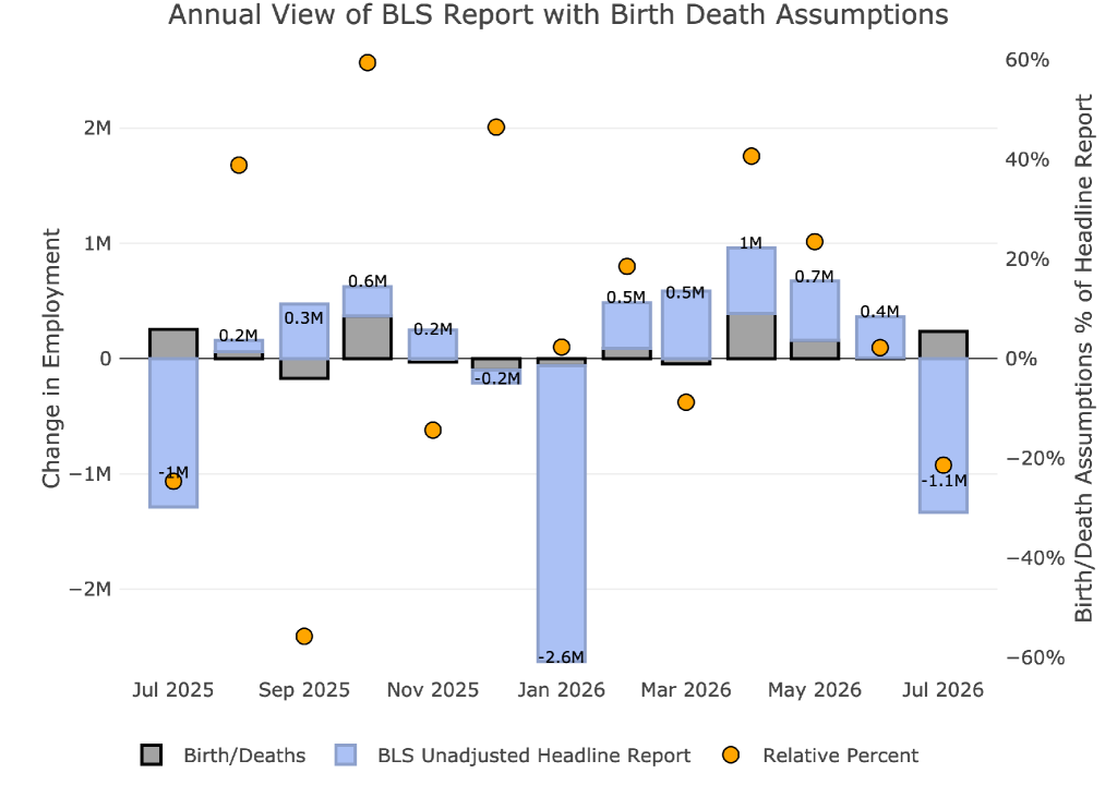
Figure: 3 Primary Unadjusted Report With Birth Death Assumptions – Monthly
We are now in the second year of a situation where assumed births is positive while the actual jobs created are negative. This means that BLS continues to assume job growth through business birth while the rest of the economy sheds jobs. This is the difference between assumed jobs and actual jobs.
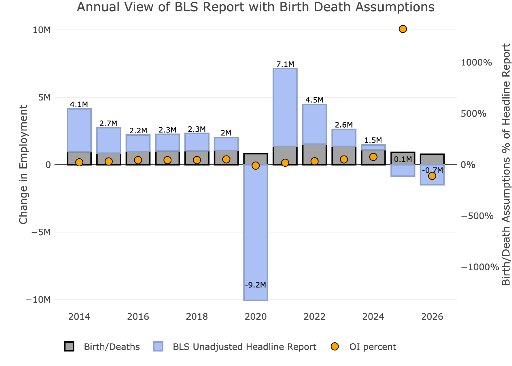
Figure: 4 Primary Unadjusted Report With Birth Death Assumptions – Monthly
The other report released in June is the Quarterly Census of Employment and Wages (QCEW). According to the BLS, this is a far more accurate and rigorous report covering 95% of jobs available at a highly detailed level. Due to the rigor, the report is released quarterly on a several month lag.
The latest report is for Q4 2025. As shown, November and December were both below the Headline Report, while October was above.
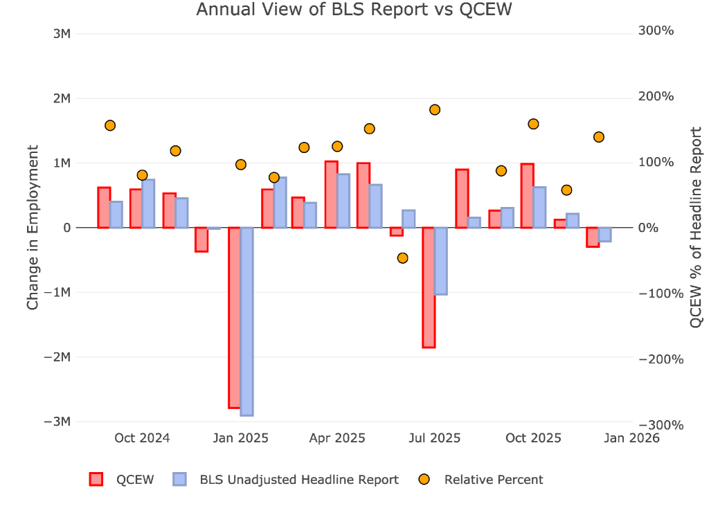
Figure: 5 Primary Report vs QCEW – Yearly
This QCEW data reveals that the economy gained a total of 300k jobs through all of 2025. Outside of Covid, this is the weakest year since 2010. Ironically, because of all the downward revisions of the Headline report, the QCEW was larger than the Headline report which showed an abysmal 175k total jobs for 2025.
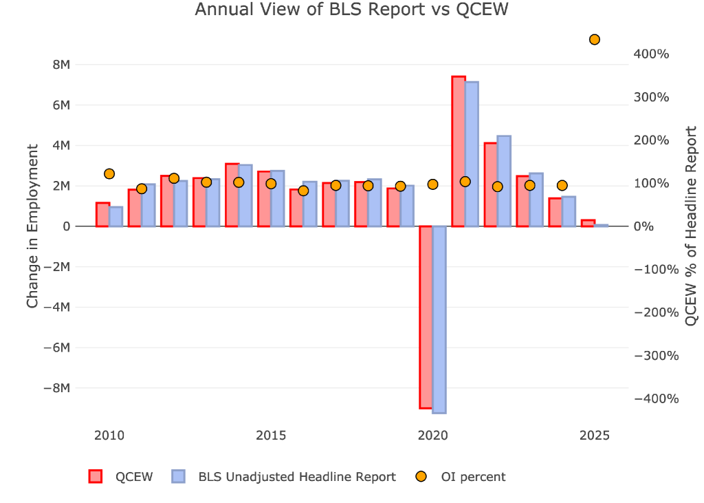
Figure: 6 Primary Report vs QCEW – Yearly
Digging Into the Headline Report
Unfortunately, despite being highly unreliable, the Headline report is the best data we have for the more recent periods. Furthermore, this is the data the Fed uses to shape its policy. Even though Warsh is trying to be more discreet about how the Fed is going to work, the jobs number still holds a lot of weight at the Fed.
The negative job growth actually came with a drop in the unemployment rate to 4.1%, down from 4.3% in May and 4.5% last November. This is the lowest unemployment rate since last June.
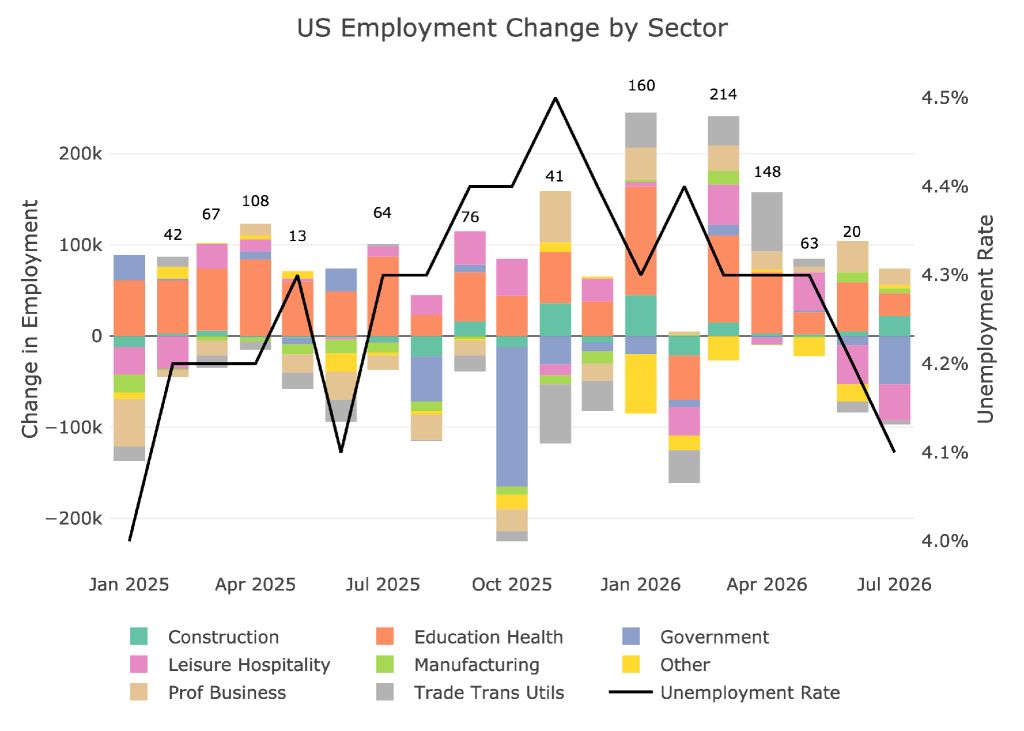
Figure: 7 Change by sector
Jobs by Category
Despite the meager job gains, the losses were concentrated in Leisure and Hospitality along with Government. Four of the eight categories were actually above the 12-month trend.
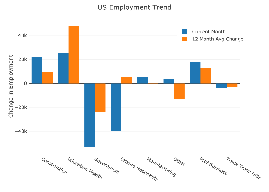
Figure: 8 Current vs TTM
The table below shows a detailed breakdown of the numbers.
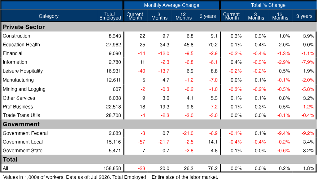
Figure: 9 Labor Market Detail
Revisions
This is the biggest story of the jobs report. After all the revisions, the job picture is significantly bleaker than the data originally showed. Ironically, we have seen some positive revisions recently but that ended in the month of May where jobs were revised down by almost 90k and then in June by 37k jobs.
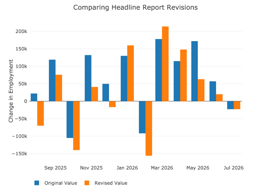
Figure: 10 Revisions
Over the last twelve months, jobs have been revised down by about 38k per month!
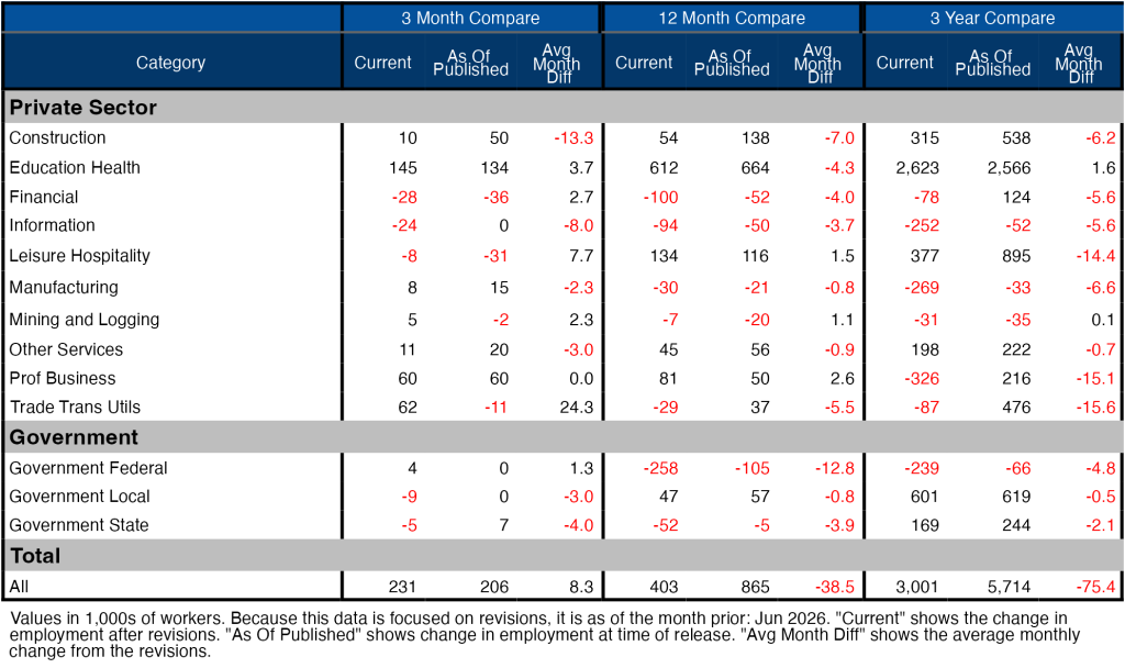
Figure: 11 Revisions
More Detail in the Household Survey
Another level of detail in the Household report shows full-time vs part-time job holders. The data shows full-time jobs being lost for four months in a row. Not good!
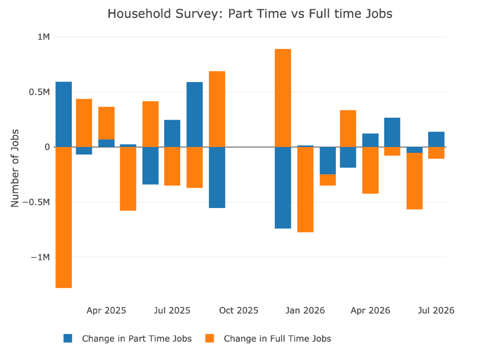
Figure: 12 Full-Time vs Part Time
Historical Perspective
The chart below shows data going back to 1955.
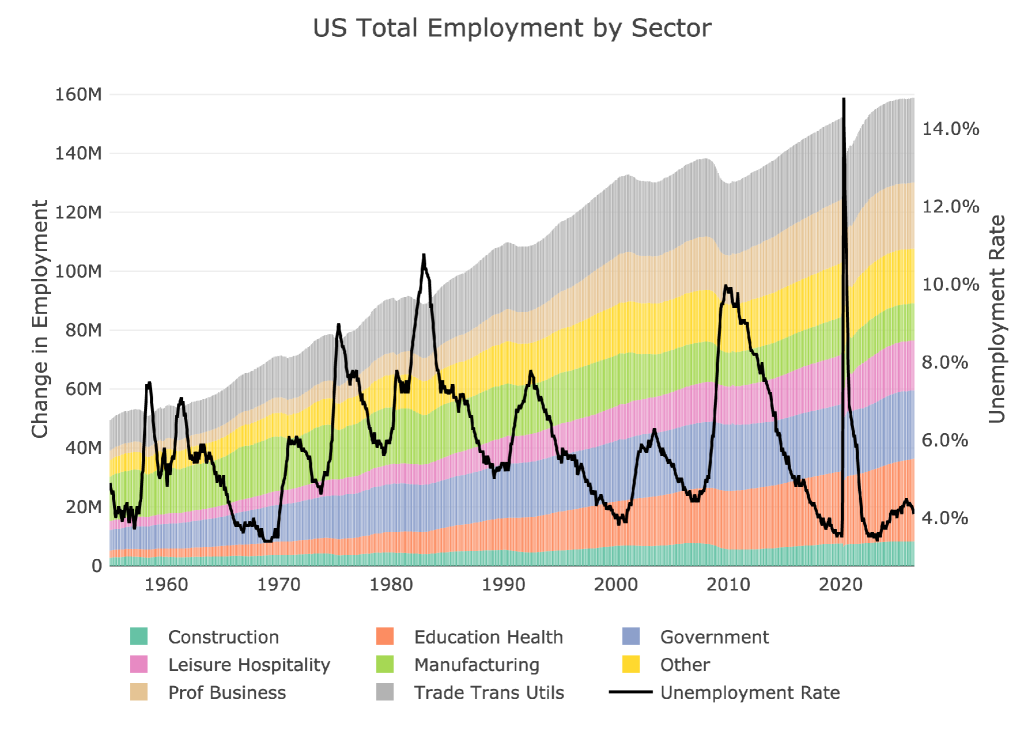
Figure: 13 Historical Labor Market
The labor force participation rate is still well below the highs before the Global Financial Crisis. This month showed it collapsing to 61.4%, the lowest level since March 2021. As recently as November of last year, the participation rate was 62.5%. This is a very notable trend and worth watching in the months ahead.
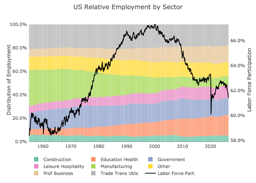
Figure: 14 Labor Market Distribution
Conclusion
Today’s job report was a disaster. Everything is pointing to a very bleak employment outlook:
- The QCEW, while better than the Headline Report, still showed very meager gains for 2025.
- Negative job growth on the Headline Report is always a bad thing
- Downward revisions continue to make things even worse
- The Birth/Death shows that the jobs being created are most likely assumed anyway
The mid-terms are around the corner and Trump is going to have a hard time selling a strong economy. Furthermore, Warsh, who is already hesitant to raise rates, has even more reason to pump the brakes on any rate increases. He may talk tough about getting inflation under control, but the jobs data is likely going to keep him standing pat… not to mention the massive US debt issuance that has blown a $1T hole in the US budget.

 Live Chat
 Email:
  Phone: 1-888-465-3160