
The Fed Has Added $344B in Treasury Bills in a year
The following analysis breaks down the Fed balance sheet in detail. It shows different parts of the balance sheet and how those amounts have changed. It also shows historical interest rate trends.
Breaking Down the Balance Sheet
The Fed has quietly been doing Quantitative Easing since February. The pace of accumulation has slowed in recent months, and was even negative in August. When QE was turned back on, it was intended for purchases of Bills to keep liquidity high. As shown below, this is still happening with the Fed accumulating $29B of Bills in August. The net drop came from MBS and 5-10 year notes rolling off.
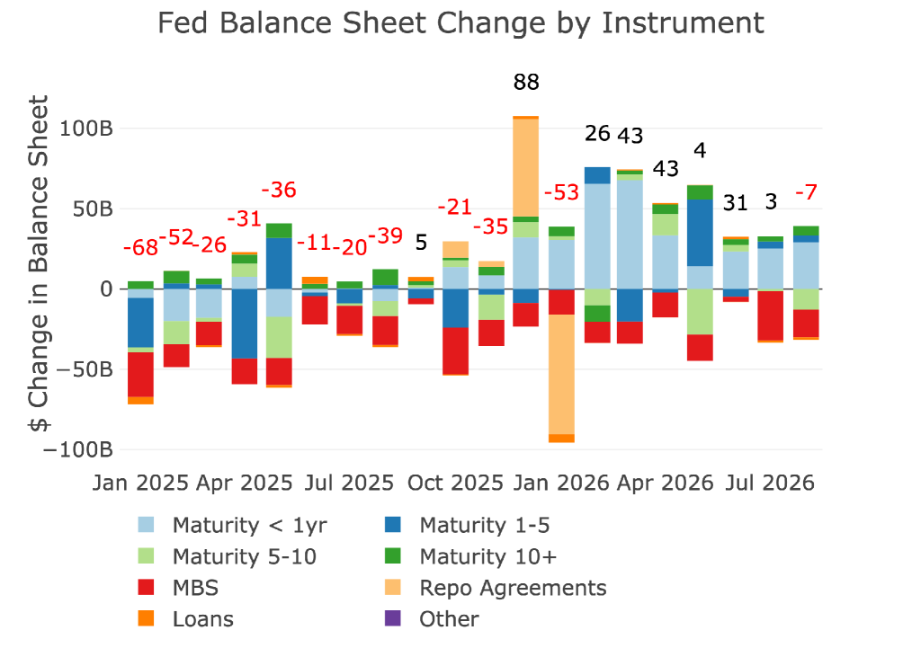
Figure: 1 Monthly Change by Instrument
Zooming out to 10 years and grouping the data by year shows the chart below. What you should notice is how quickly the Fed will un-do all the “hard work” in reducing the balance sheet during the next crisis. It took 4 years to reduce the balance sheet about $2.2T. However, in 2020, it took a few months to grow the balance sheet by $3T and 2 years to grow it by $4.5T.
So far this year, the Fed has increased the balance sheet by $90B. While this is a small increase relative to past years, it should be noted that the balance sheet is growing and not shrinking. This makes it harder for inflation to come down.
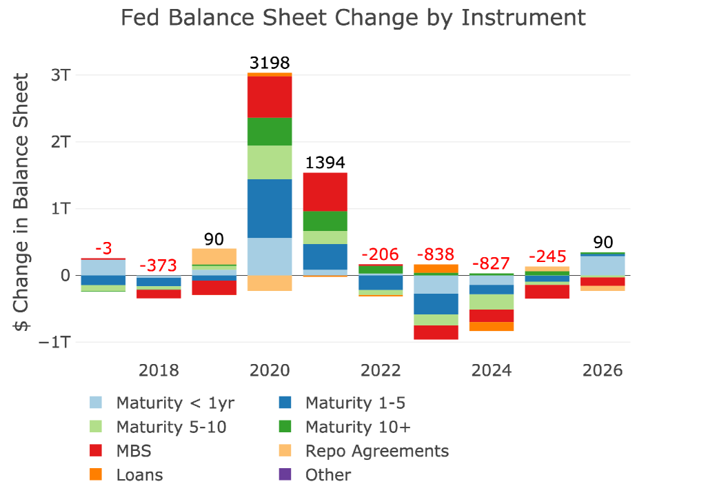
Figure: 2 Monthly Change by Instrument
The table below provides more detail on the Fed’s activities and its recent efforts to manage the balance sheet.
The biggest thing to notice is how the Fed has increased the holdings of Bills by $344B over the last year! That is an increase that should not go unnoticed. Why is the Fed focused on buying Bills? Bills are typically the most liquid asset in the Treasury issuance list, so it’s confusing why the Fed has stepped in for liquidity reasons.
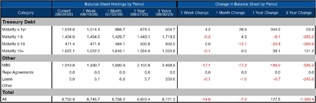
Figure: 3 Balance Sheet Breakdown
The weekly activity can be seen below. It’s very obvious in this chart to see the continued buying of Treasury Bills each week.
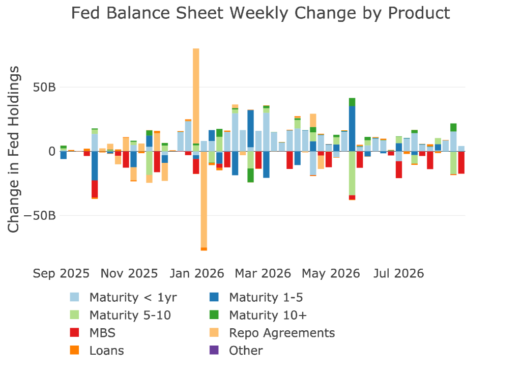
Figure: 4 Fed Balance Sheet Weekly Changes
The chart below shows the balance on detailed items in Loans and also Repos. These were the programs set up in the wake of the SVB collapse. All of the programs have dropped down to zero at this point, but as mentioned above, the Fed would like to see more usage of the Repo market (Standard Repo Facility or SRF).
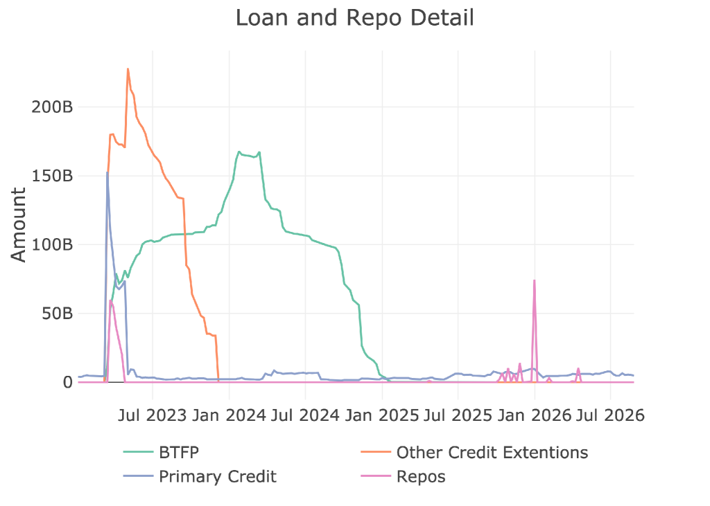
Figure: 5 Loan Details
Yields
Yields have been fluctuating within a band since Sept 2022, ranging mostly between 3.25% and 4.75%. That range was broken in June with 30-year rates breaking decisively over 5% and the 10-year breaking above 4.5%. This is why the Treasury has stepped into the market. They are seeing cracks in the bond market and it could have major implications.
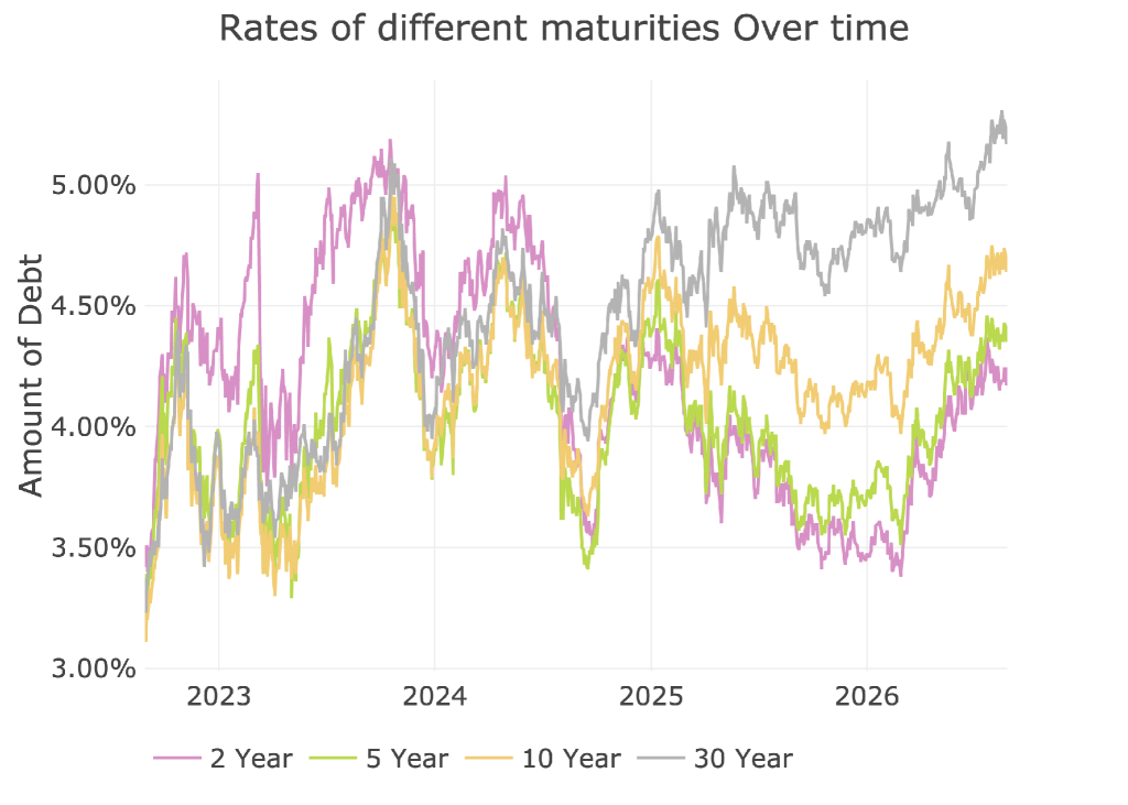
Figure: 6 Interest Rates Across Maturities
The yield curve spread has also started to widen again which means investors are demanding more compensation for keeping dollars locked up for longer periods.
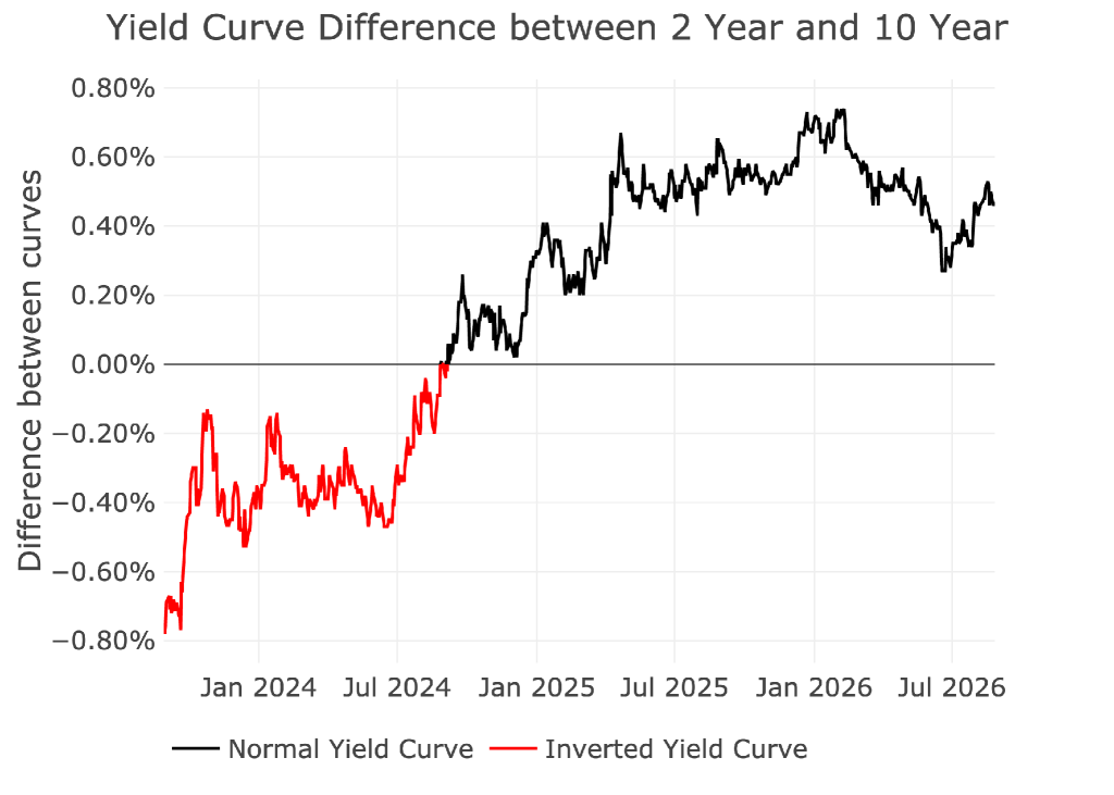
Figure: 7 Tracking Yield Curve Inversion
The chart below shows the current yield curve, the yield curve one month ago, and one year ago. Again, it is clear to see how the yield curve has started to steepen. This makes the Treasury’s job much harder.
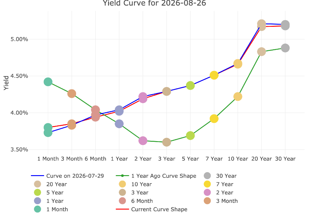
Figure: 8 Tracking Yield Curve Inversion
Loss of Appetite for US Debt Abroad
Perhaps the most concerning thing is the dropping interest in US Debt internationally. Total holdings of US Debt has actually fallen from the $9.4T peak seen in Q1. While the US treasury issues ever more debt, it is a very bad sign to see foreign holders not stepping in to buy.
Note: data is updated on a lag. The latest data is as of June
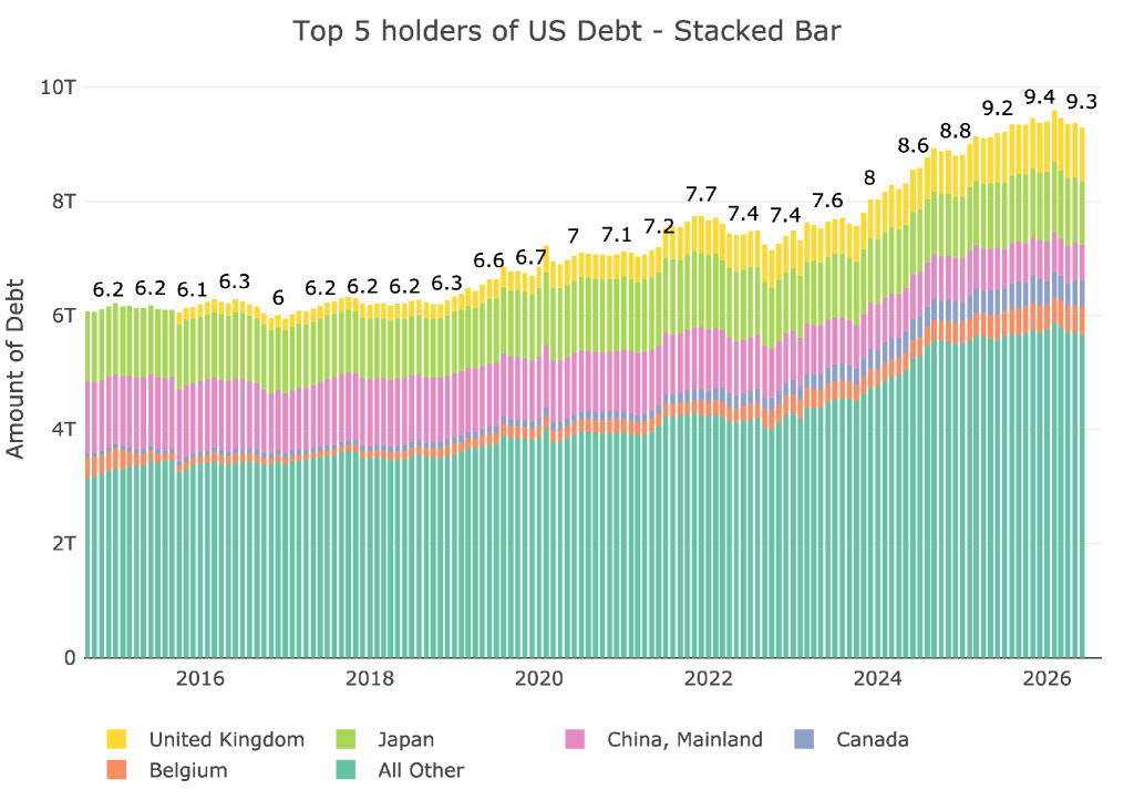
Figure: 9 International Holders
The chart below shows a breakdown of the bigger countries. China’s US Debt holdings have fallen to $630B, a drop of $100B since last year. The UK now holds more US Debt than China does. Japan holdings have basically been flat for the last decade floating between $1T and $1.25T. The Japanese cannot turn into sellers or it would add even more pain. This is why the US has stepped into the currency market as well.
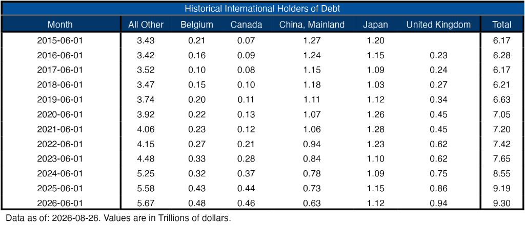
Figure: 10 Average Weekly Change in the Balance Sheet
Historical Perspective
The final plot below takes a larger view of the balance sheet. It is clear to see how the usage of the balance sheet has changed since the Global Financial Crisis. This also highlights the rapid increase and steady decrease. The Fed can never actually shrink its balance sheet back to the previous state, it just does minor reductions when it can before the next crisis blows it up again. Based on the trajectory of the Fed balance sheet, that next crisis might be closer than anyone thinks!
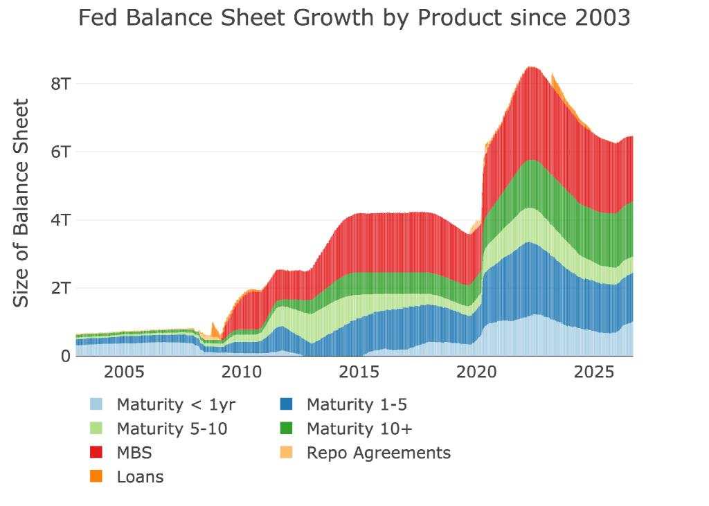
Figure: 11 Historical Fed Balance Sheet
Conclusion
Warsh has come in with a new message: after 5+ years, the Fed is ready to get inflation under control. That’s much easier to say than do. This is really a situation of math more than anything else. If the Fed raises rates then the government borrowing costs will continue to increase. That cannot happen. The only option is to keep rates flat or lower them. They just need the right excuse.

 Live Chat
 Email:
  Phone: 1-888-465-3160